This project involved designing branded napkins as part of BHC Chicken’s in-store dining experience. The objective was to create a functional touchpoint that reinforces brand identity in a subtle, approachable way.
The final approved design features a light, repeating illustration pattern inspired by BHC Chicken’s menu items, paired with minimal logo placement. The restrained use of branding keeps the napkin visually clean while still recognisably on-brand. Presented in a tabletop setting, the design reflects real usage and enhances the overall dining atmosphere without overwhelming it.
Design Development & Explorations
Several alternative concepts were also explored, testing bolder logo repetition and more graphic-driven layouts. While these were not selected for production, they helped define the preferred balance between brand visibility and subtlety, ultimately informing the direction of the final design.
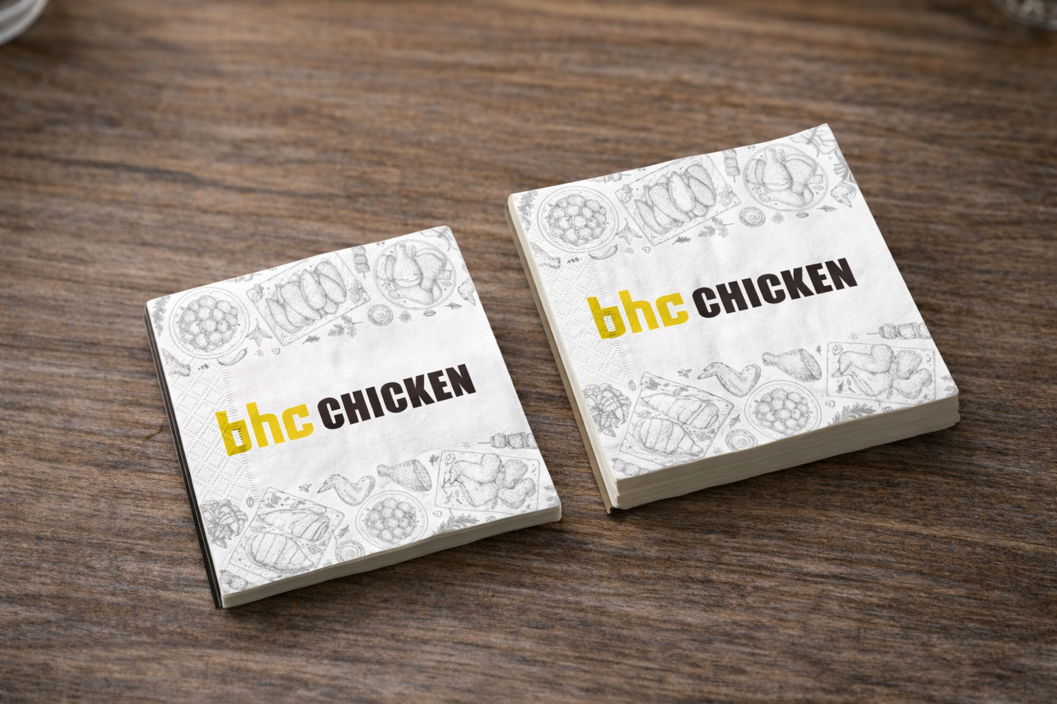 Image 1 of 8
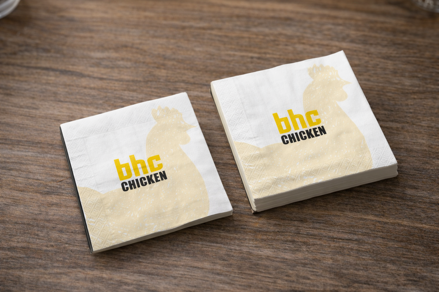 Image 2 of 8
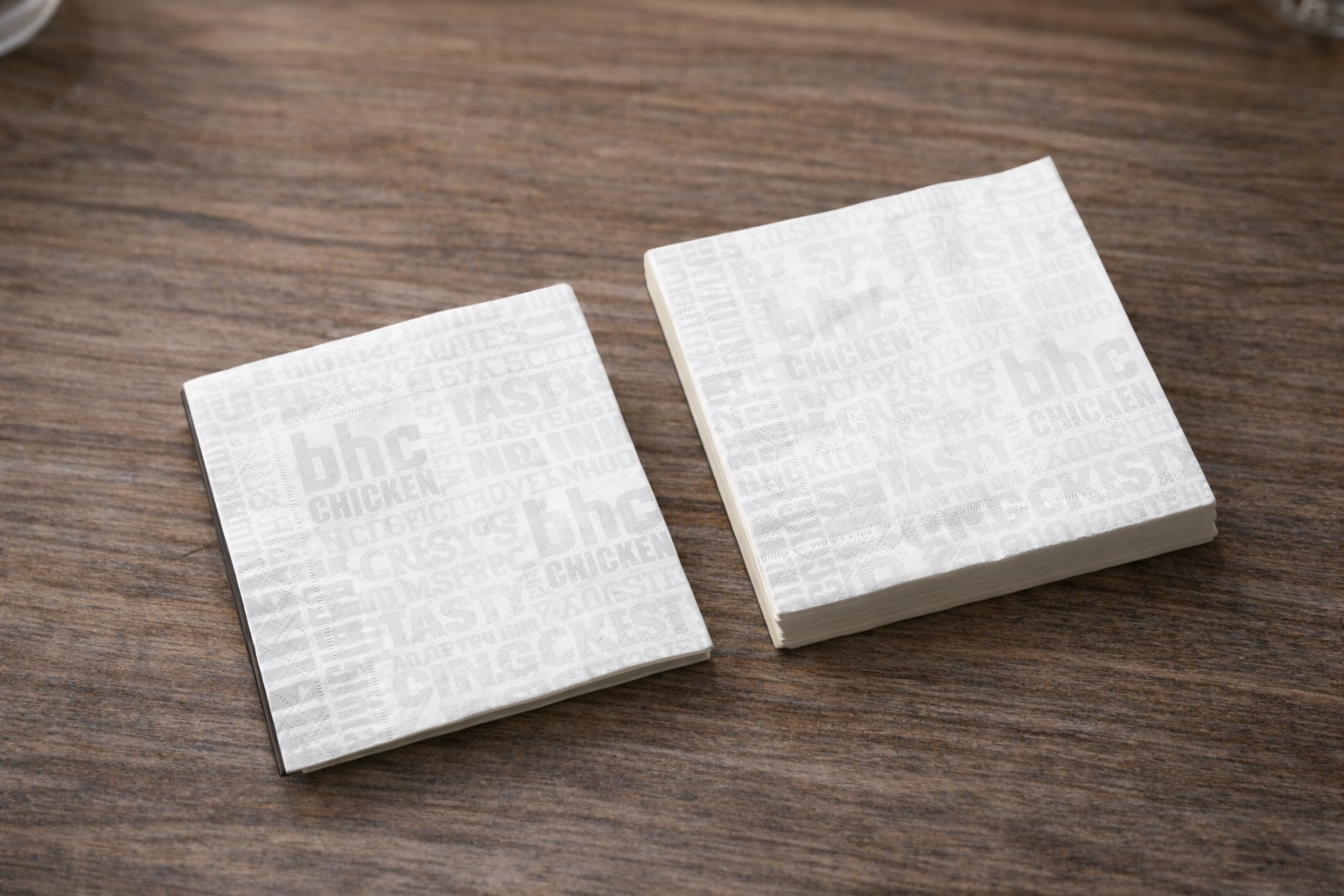 Image 3 of 8
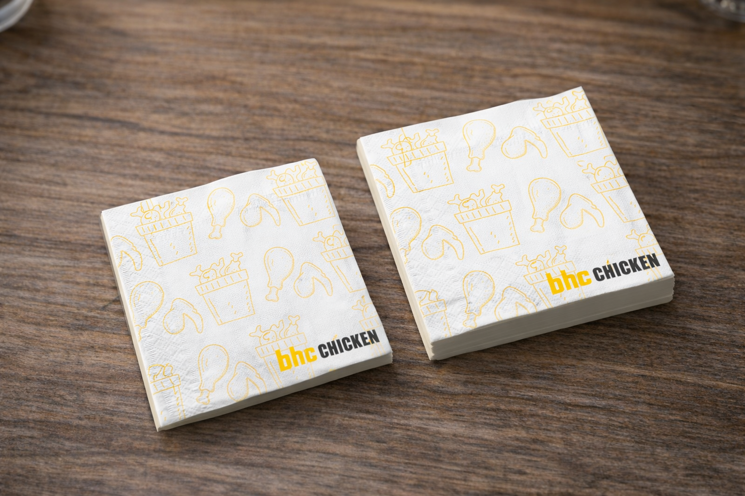 Image 4 of 8
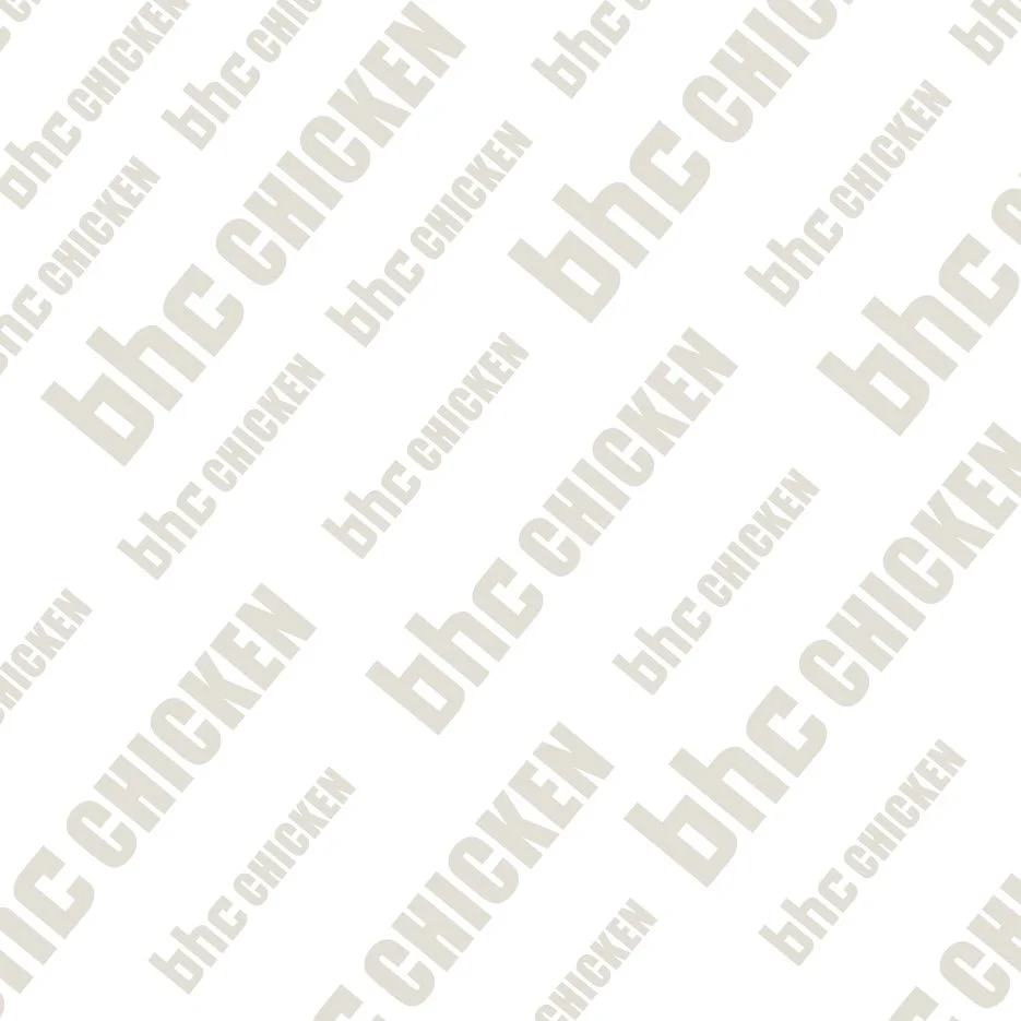 Image 5 of 8
 Image 6 of 8
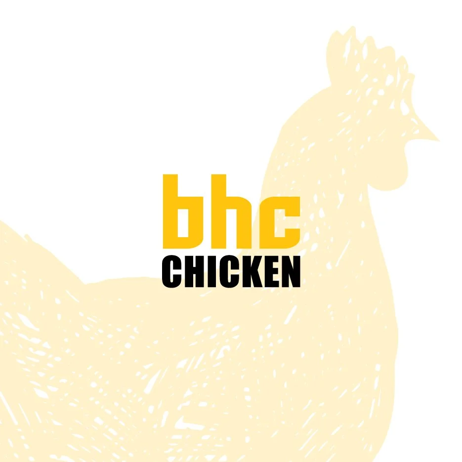 Image 7 of 8
 Image 8 of 8