 Image 1 of 4
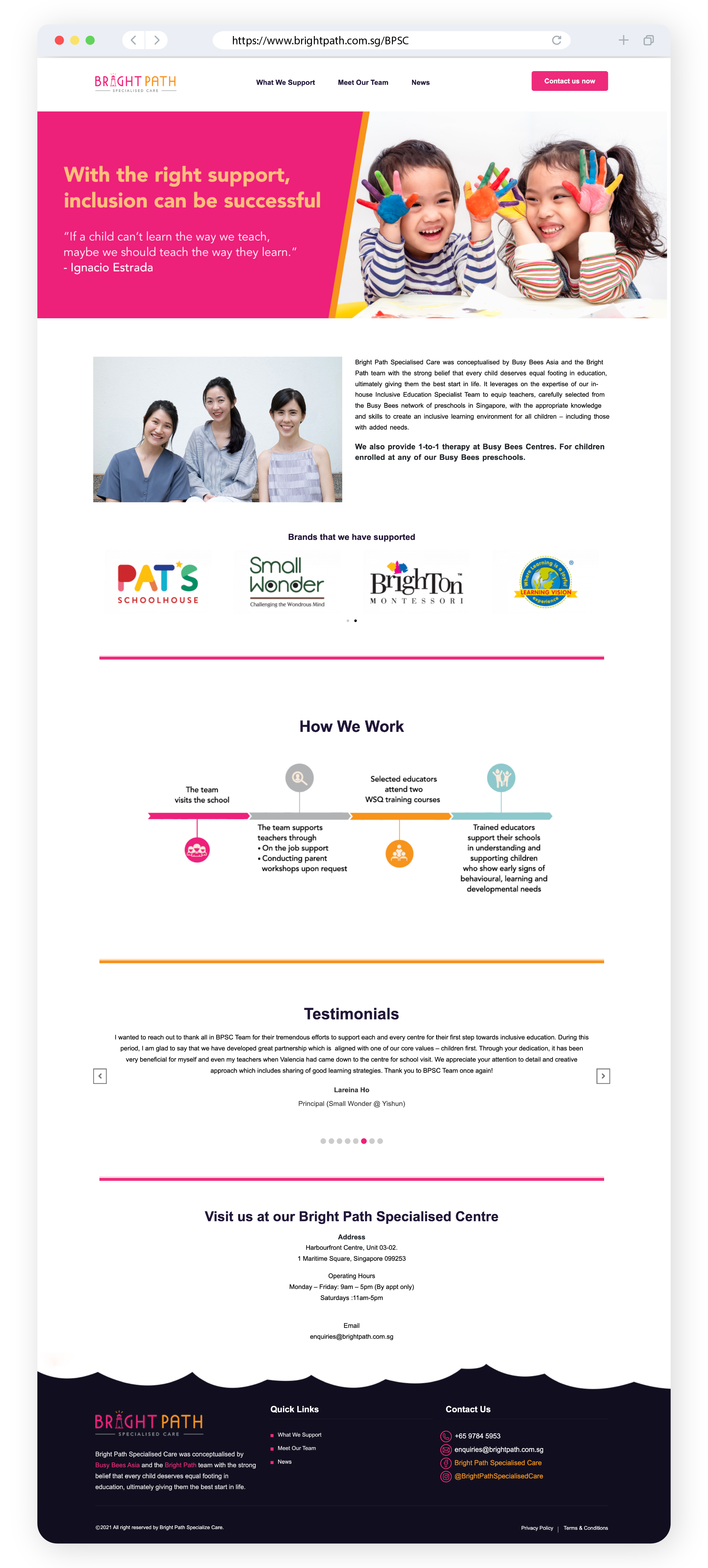 Image 2 of 4
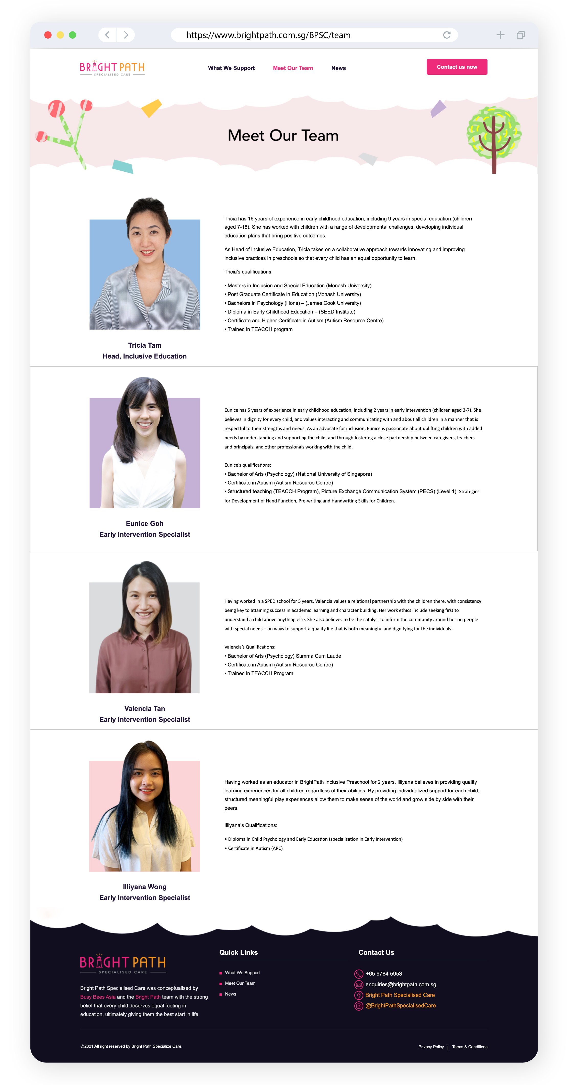 Image 3 of 4
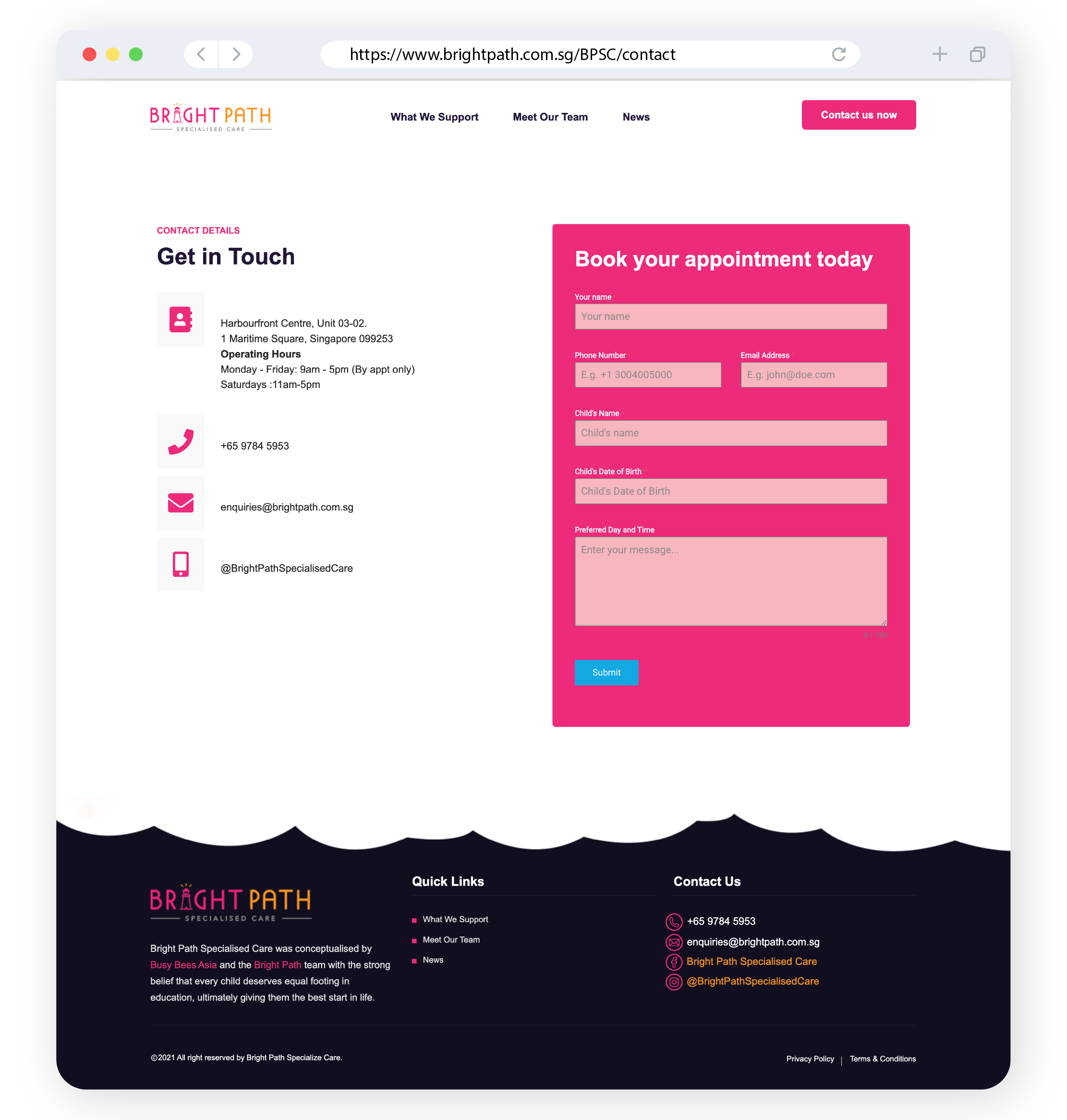 Image 4 of 4
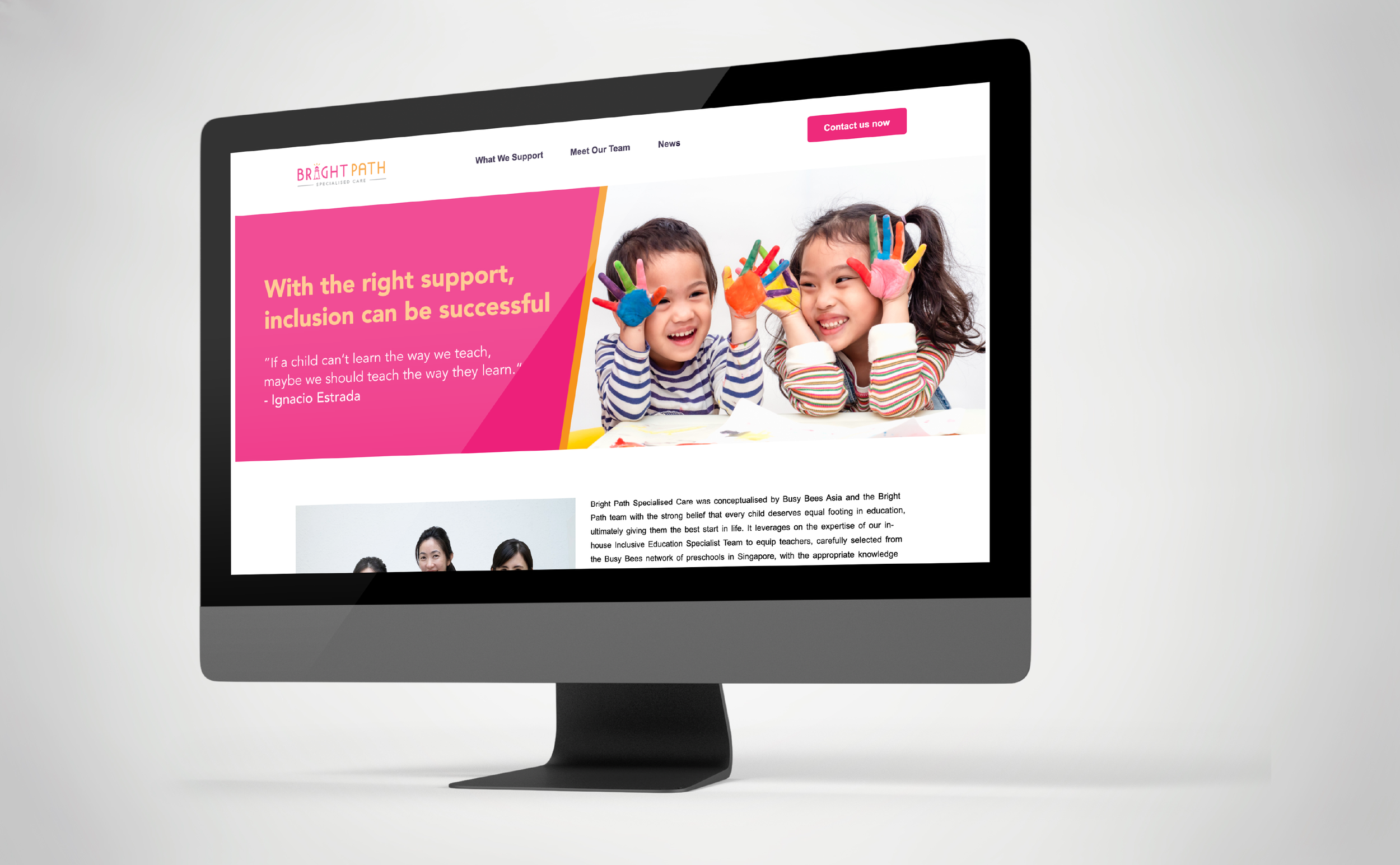
A website redesign for Bright Path, an inclusive early intervention preschool, aimed at creating a more structured, accessible, and reassuring digital experience for parents. The goal was to translate the brand’s nurturing and professional approach into a clear and intuitive online platform.
The redesign focuses on improving content clarity and navigation, ensuring that key information—such as programmes, learning approaches, and support services—is easy to understand and access. Given the nature of early intervention education, where parents often seek detailed and sensitive information, the layout was carefully structured to reduce overwhelm while maintaining depth and transparency. Bright Path’s emphasis on personalised learning and holistic development informed the need for a site that communicates trust, care, and expertise effectively.
Visually, the design adopts a clean and calming aesthetic, balancing warmth with professionalism. Thoughtful use of spacing, typography, and imagery helps guide users through the content, while reinforcing a sense of reassurance and credibility. The result is a more cohesive and user-friendly experience that supports both exploration and decision-making for parents.