This project involved designing custom grease paper for BHC Chicken, translating the brand’s bold, energetic identity into a functional packaging touchpoint. The approved design features a repeating pattern of illustrated chicken icons and subtle typography, creating a playful backdrop that complements the product without overpowering it.
The layout was intentionally kept clean and flexible, ensuring the pattern works seamlessly across different wrapping formats while maintaining brand recognition. The use of restrained colour and line-based illustrations allows the fried chicken to remain the hero, while still delivering a strong and cohesive brand presence.
As a packaging element that customers interact with directly, the final grease paper enhances the overall dining experience by adding character, consistency, and a sense of fun to the brand.
Design Development & Explorations
In addition to the final design, three alternative grease paper concepts were developed to explore different visual directions. These ranged from logo-led compositions to bolder typographic treatments and denser graphic patterns, each testing a distinct way of expressing BHC Chicken’s brand personality.
While these concepts were not selected for production, they reflect the design exploration process behind the final outcome—balancing visual impact, usability, and brand clarity to arrive at the most suitable solution.
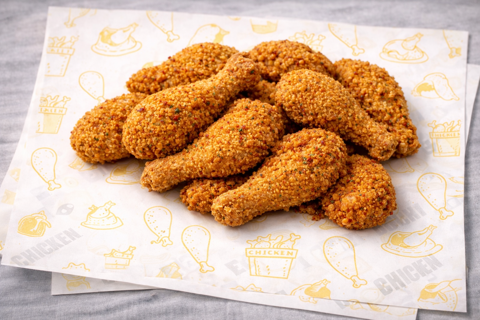 Image 1 of 9
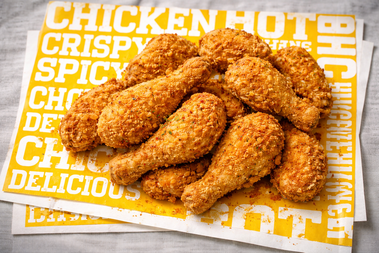 Image 2 of 9
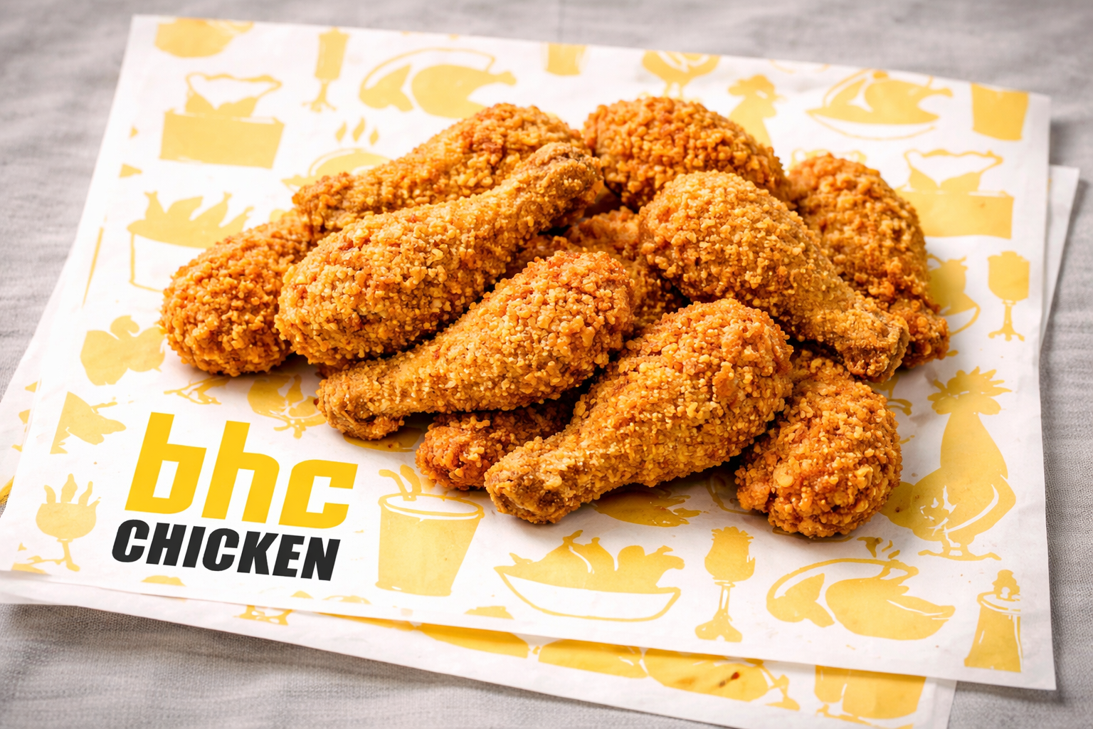 Image 3 of 9
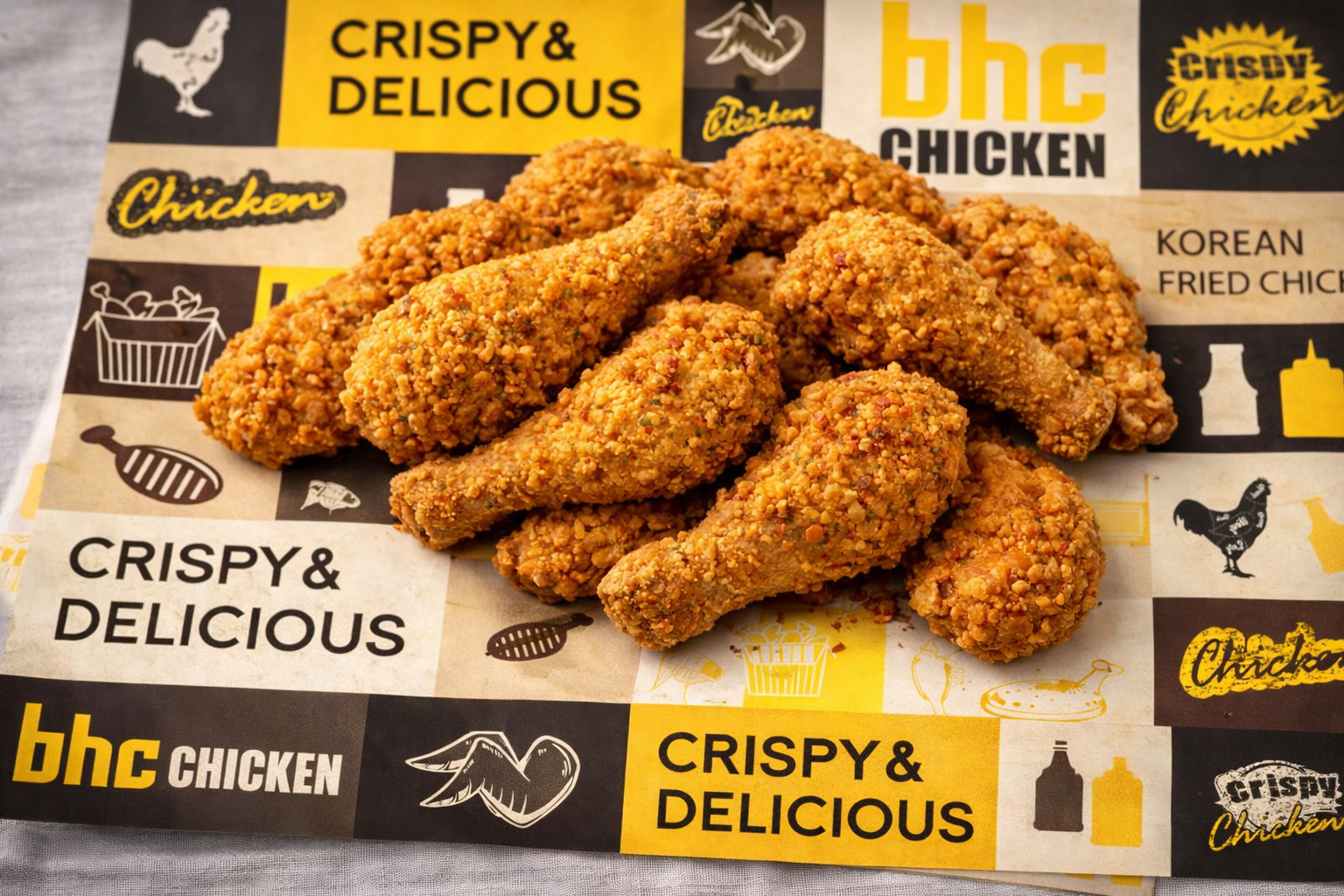 Image 4 of 9
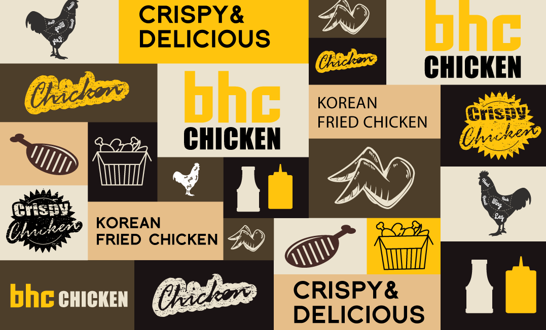 Image 6 of 9
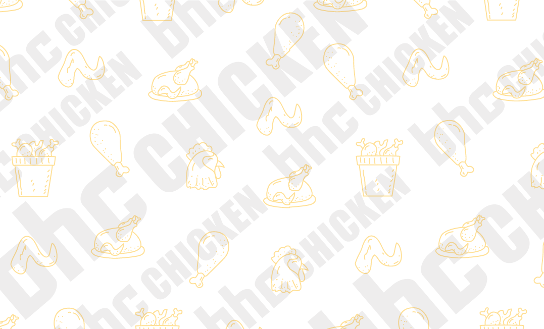 Image 7 of 9
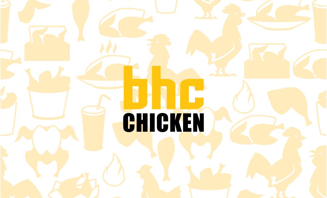 Image 8 of 9
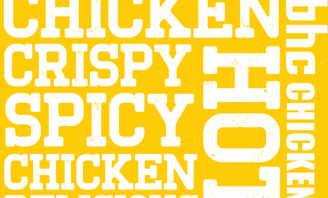 Image 9 of 9