For HAO’s Hari Raya 2020 campaign, I designed a promotional poster that brings together festive storytelling with clear and engaging retail communication. The objective was to create a visually rich layout that captures the warmth and cultural significance of the season, while effectively showcasing a wide range of promotional products.
The design draws on traditional Raya elements, incorporating a green colour palette and ketupat-inspired motifs to evoke a sense of familiarity and celebration. These elements were balanced with a structured grid system, allowing multiple products and price points to be presented in a clear and organised manner without overwhelming the viewer.
A key focus of the execution was information hierarchy and readability, ensuring that promotional highlights, product details, and pricing remained easy to scan at a glance. Despite the density of content, the layout maintains clarity through consistent spacing, alignment, and visual grouping.
The result is a festive yet functional retail visual that not only reflects the spirit of Hari Raya, but also enhances the shopping experience by making promotions accessible, intuitive, and visually engaging.
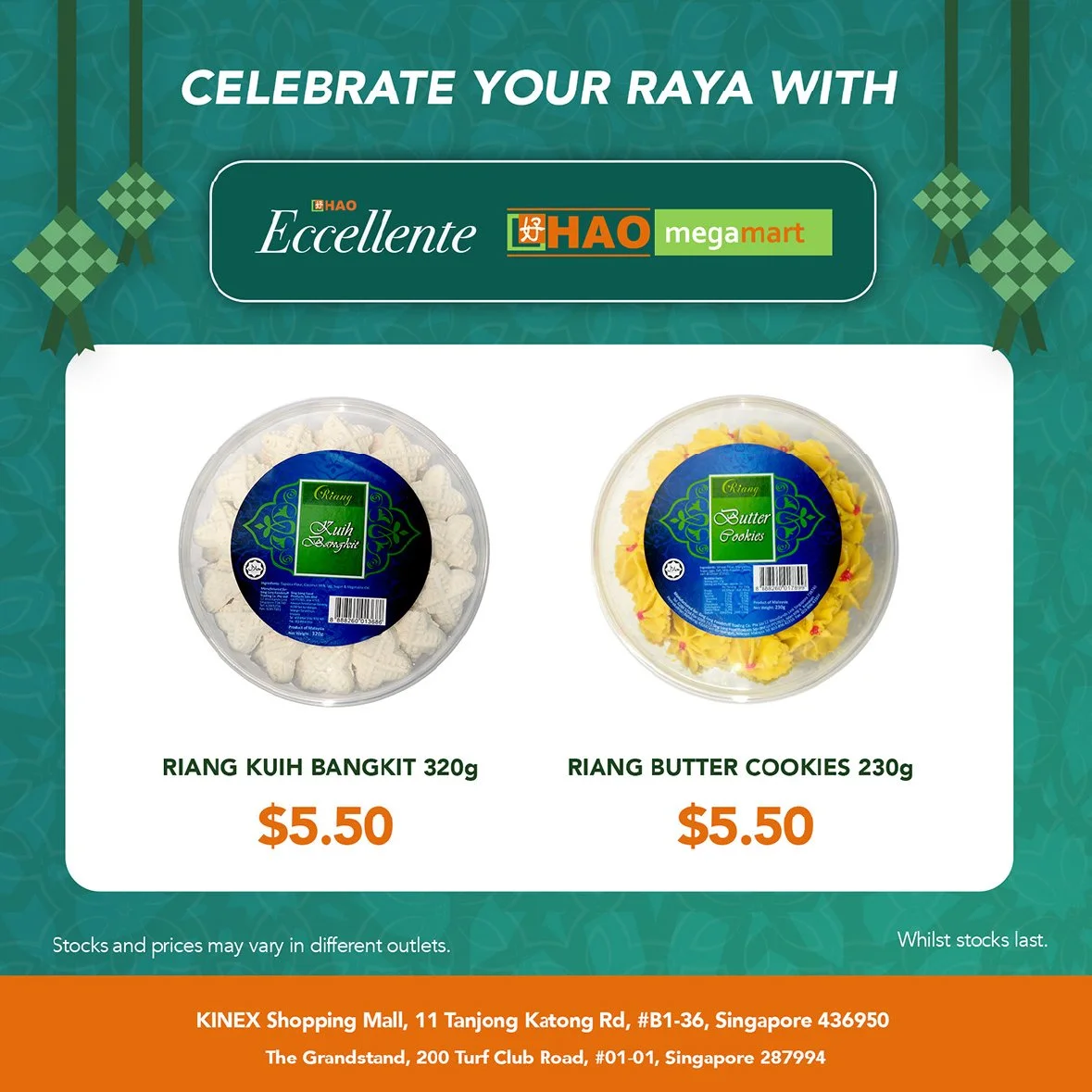 Image 1 of 8
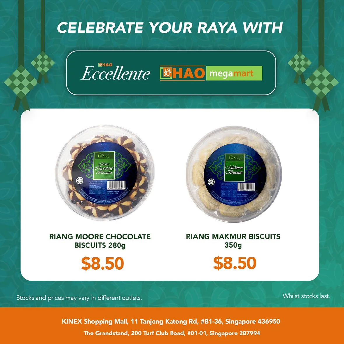 Image 2 of 8
 Image 3 of 8
 Image 4 of 8
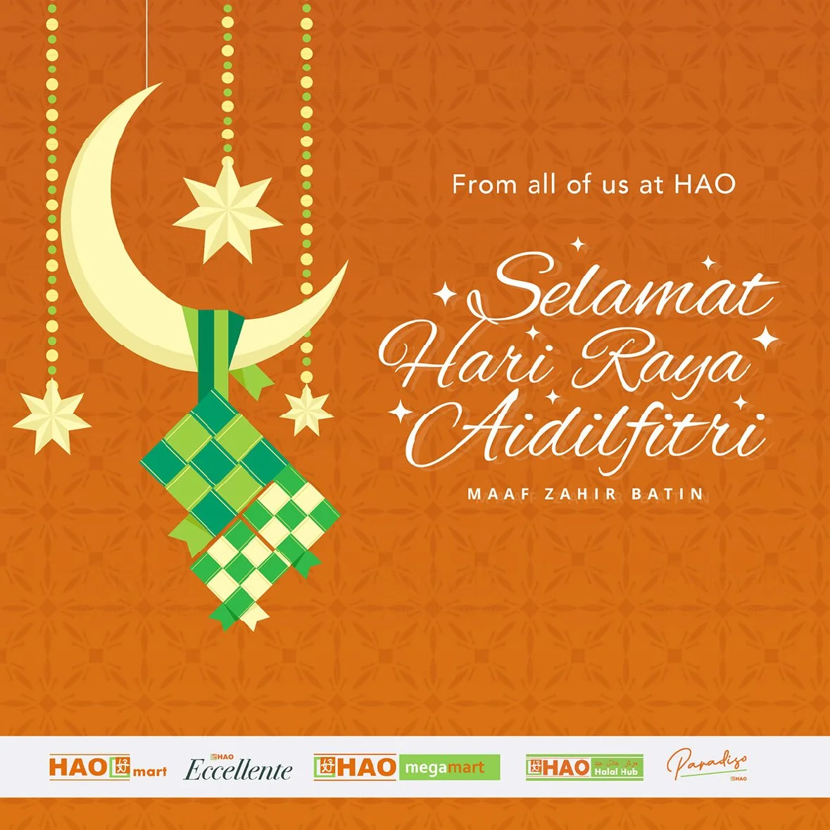 Image 5 of 8
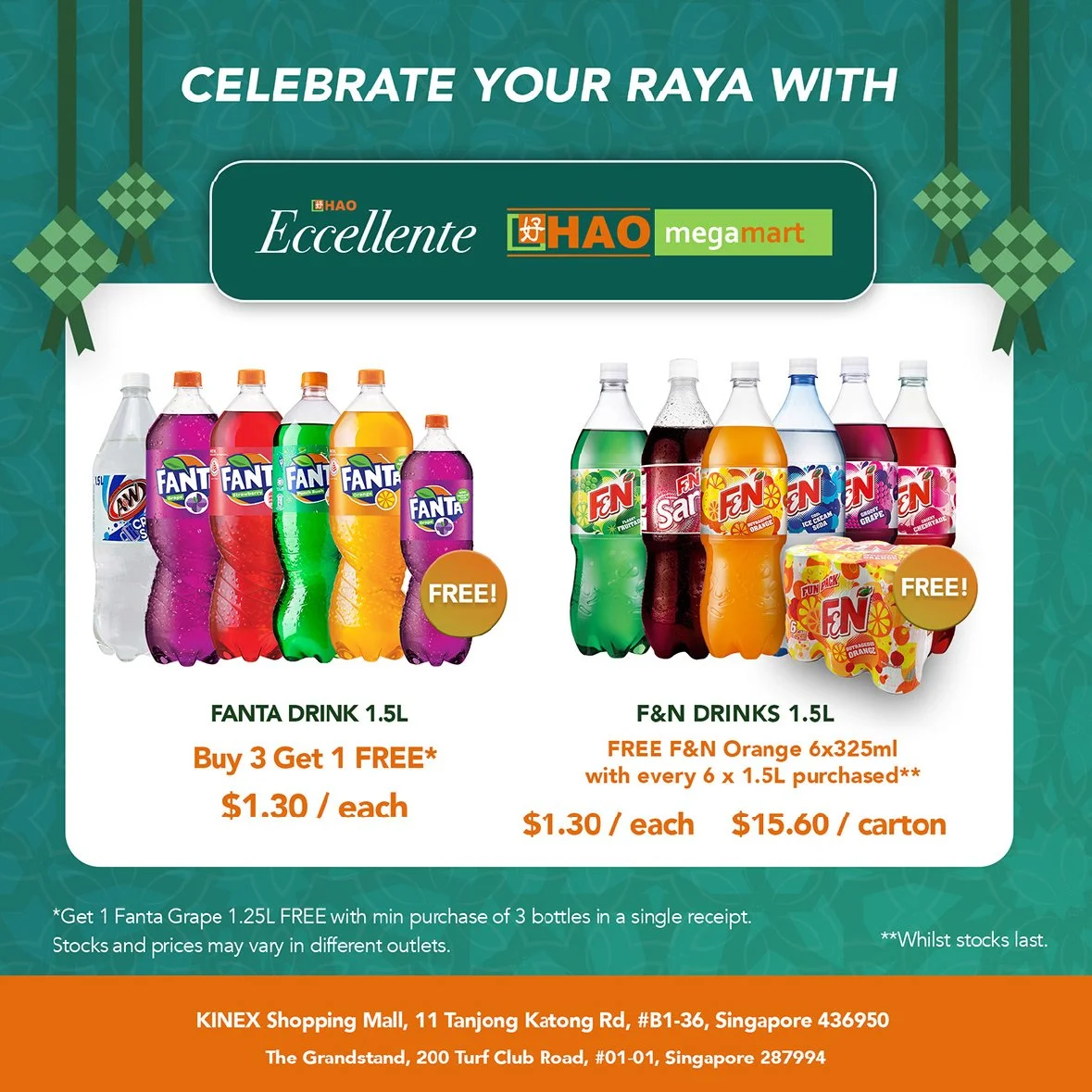 Image 6 of 8
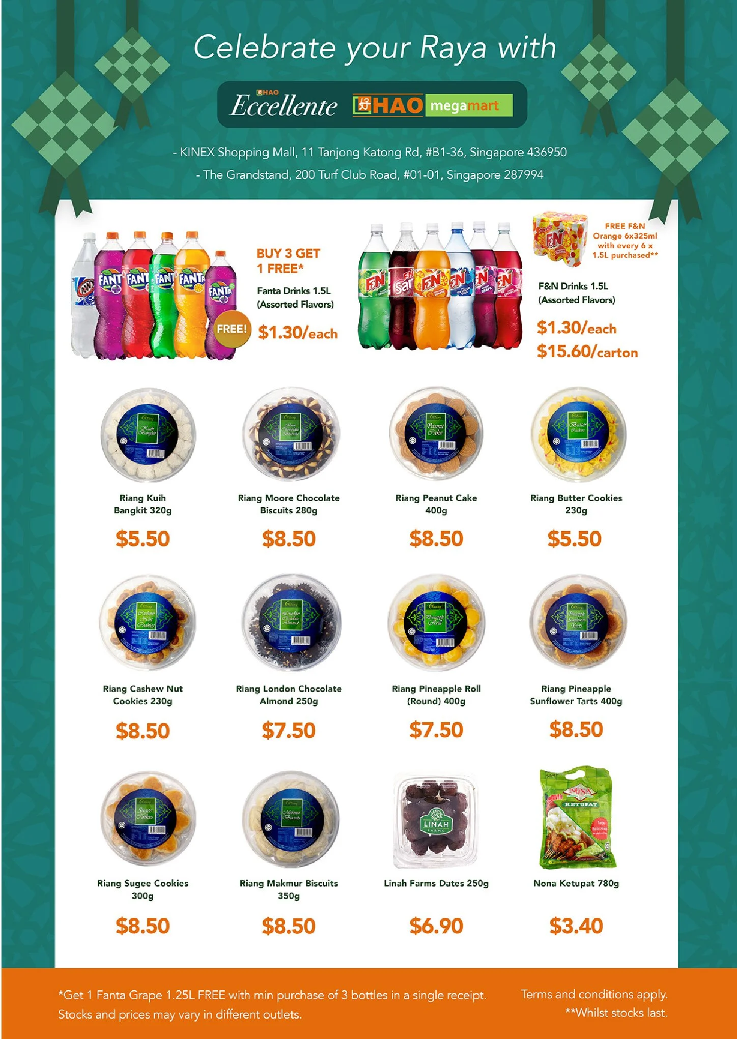 Image 7 of 8
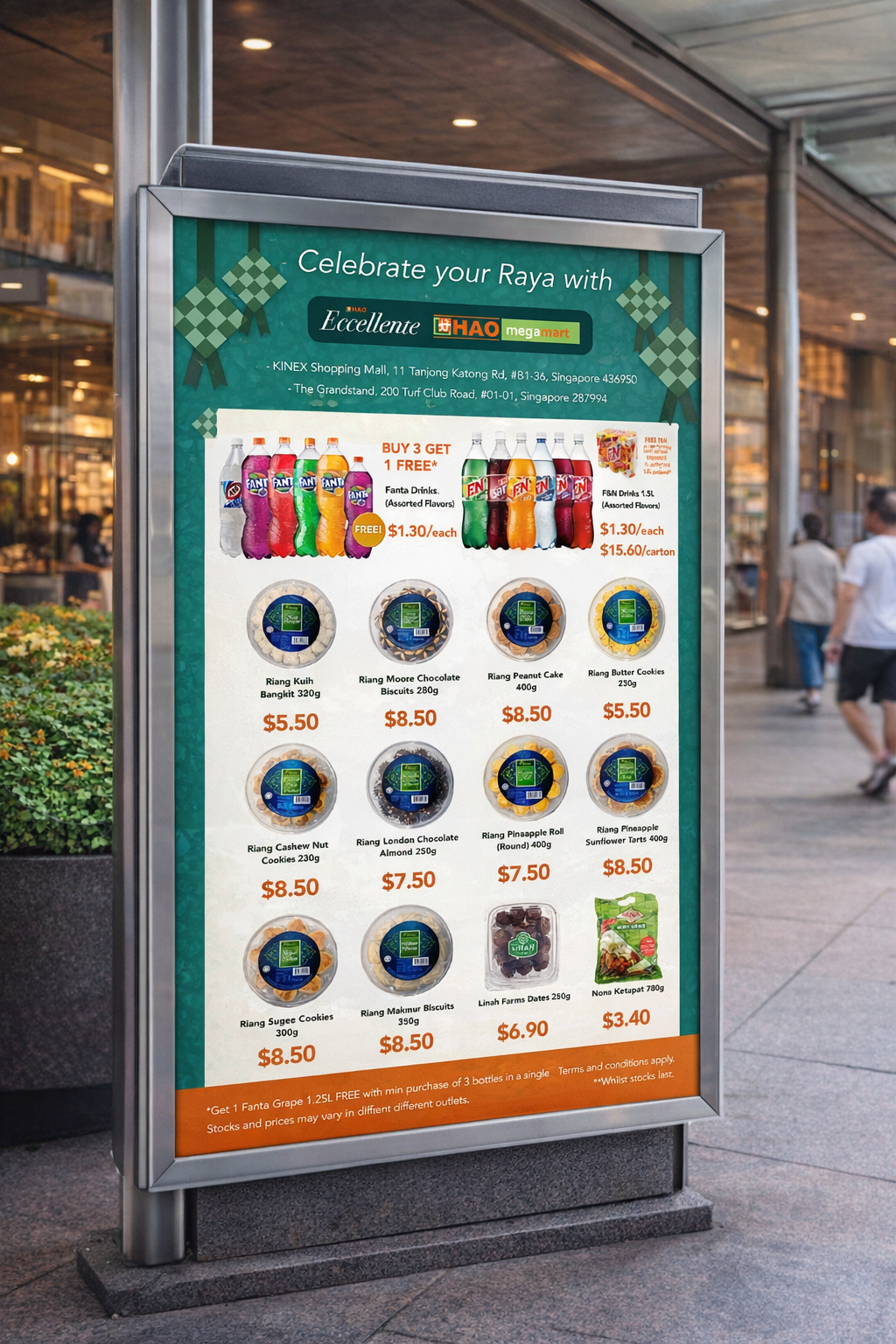 Image 8 of 8