The design of the HAO House Brand Sugar range focuses on clarity, functionality, and strong shelf presence, using a clean and structured layout to communicate product variants at a glance. A consistent visual system anchors the range, with bold colour coding to differentiate between sugar types while maintaining a cohesive brand identity across all SKUs. Typography is kept simple and legible, ensuring key information such as product type and weight is easily identifiable, while subtle graphic elements add warmth without overwhelming the packaging. The overall approach balances practicality with a modern retail aesthetic—allowing the products to stand out in-store while reinforcing HAO’s positioning as a reliable and accessible house brand.
The design of the HAO House Brand Sugar range focuses on clarity, functionality, and strong shelf presence, using a clean and structured layout to communicate product variants at a glance. A consistent visual system anchors the range, with bold colour coding to differentiate between sugar types while maintaining a cohesive brand identity across all SKUs. Typography is kept simple and legible, ensuring key information such as product type and weight is easily identifiable, while subtle graphic elements add warmth without overwhelming the packaging. The overall approach balances practicality with a modern retail aesthetic—allowing the products to stand out in-store while reinforcing HAO’s positioning as a reliable and accessible house brand.
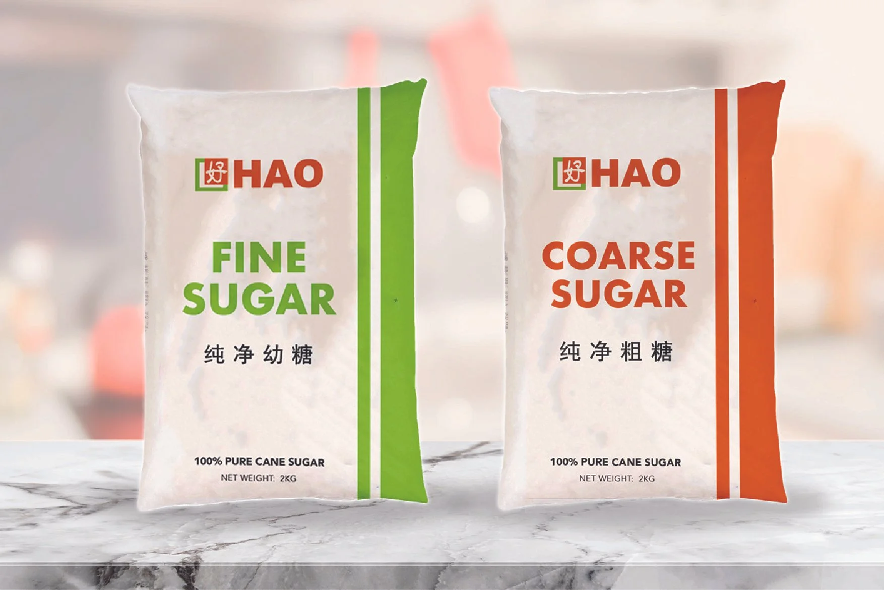 Image 1 of 10
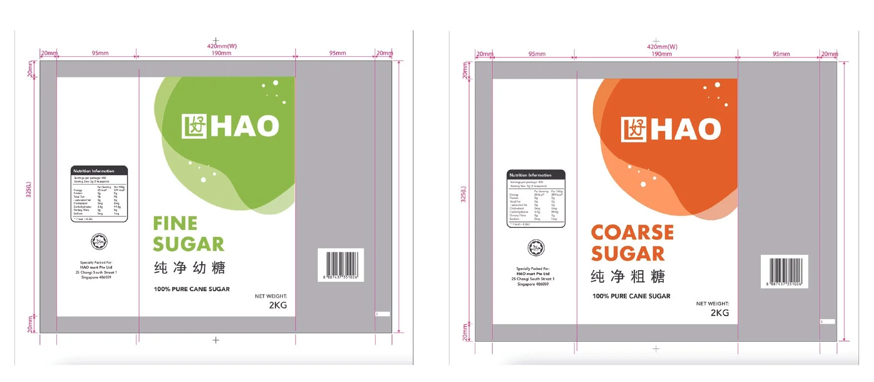 Image 2 of 10
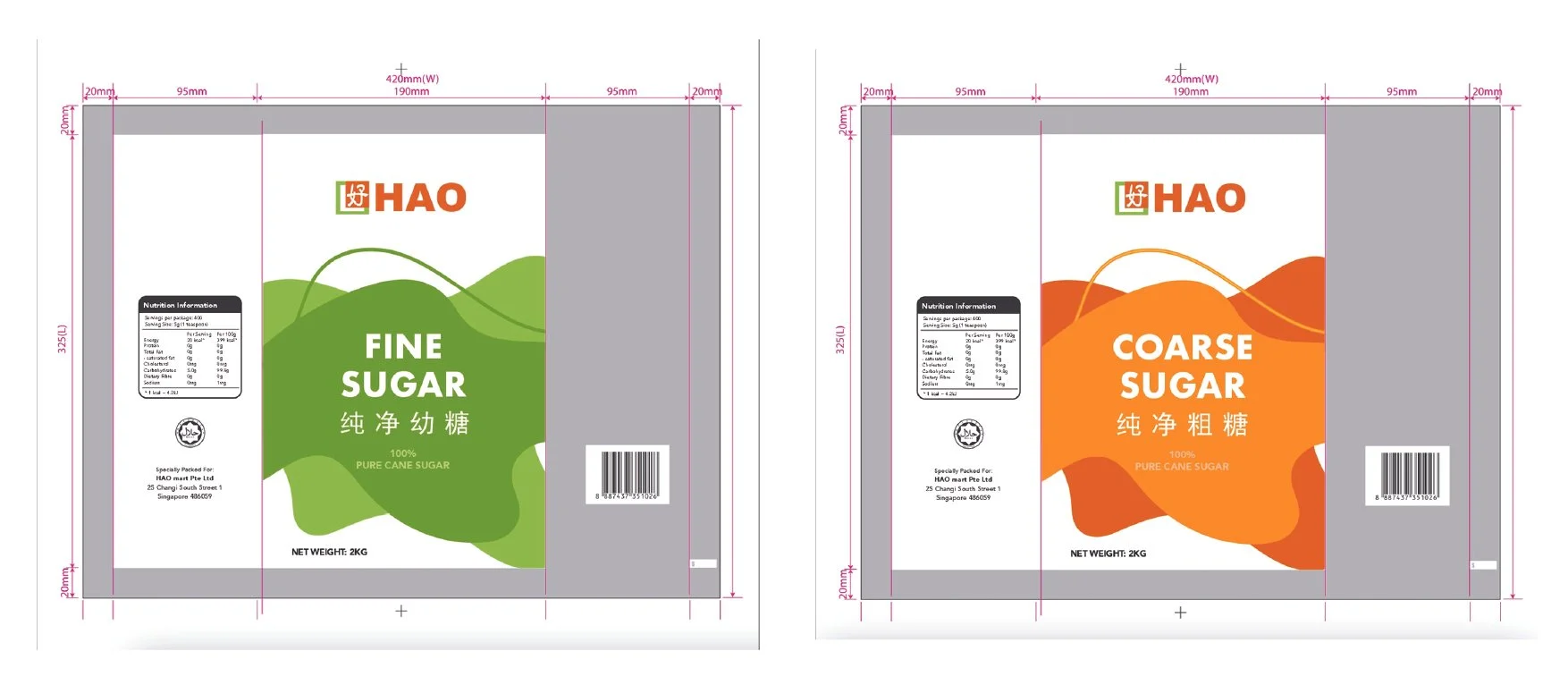 Image 3 of 10
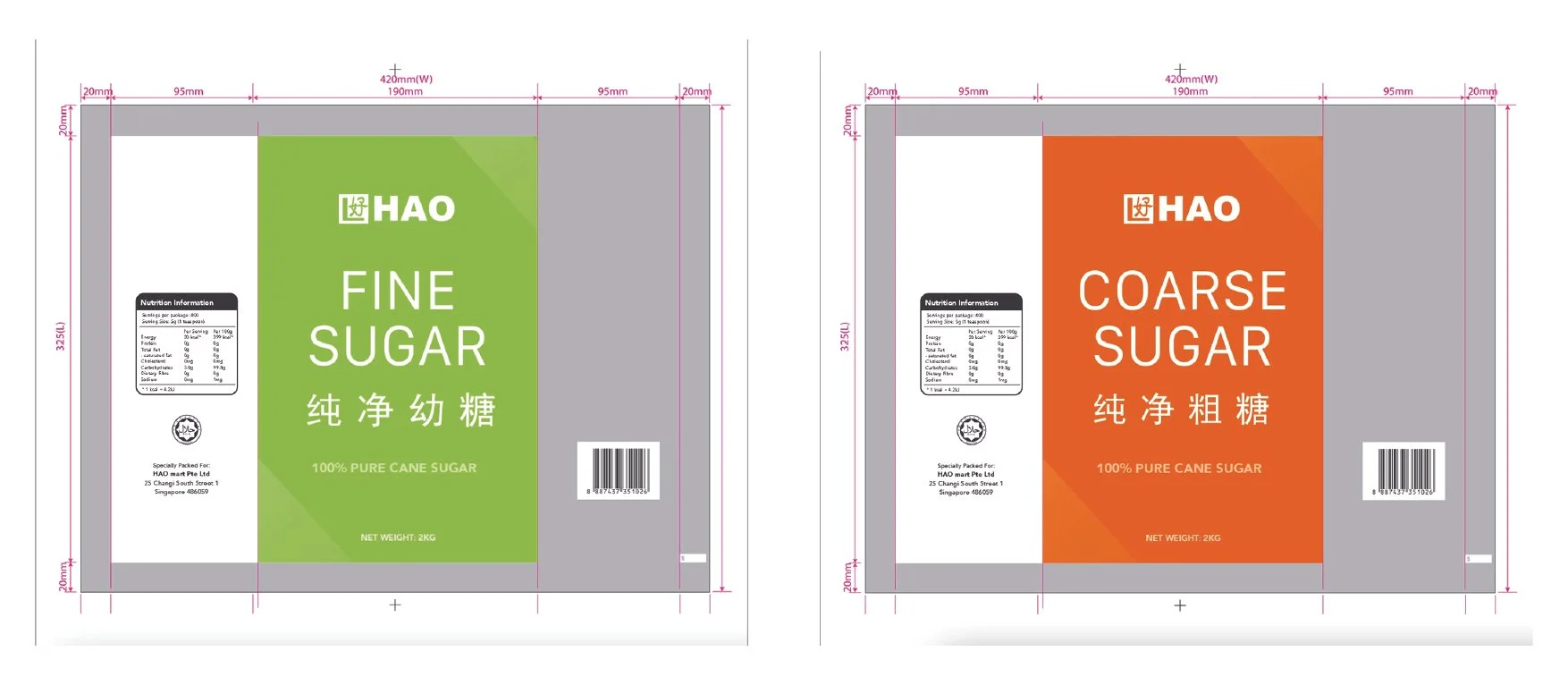 Image 4 of 10
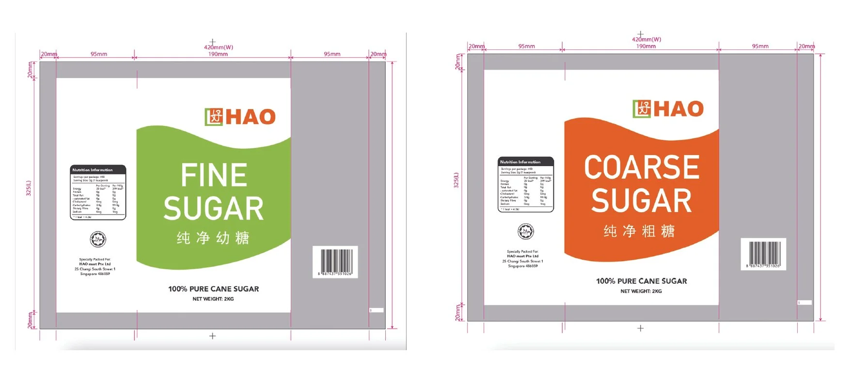 Image 5 of 10
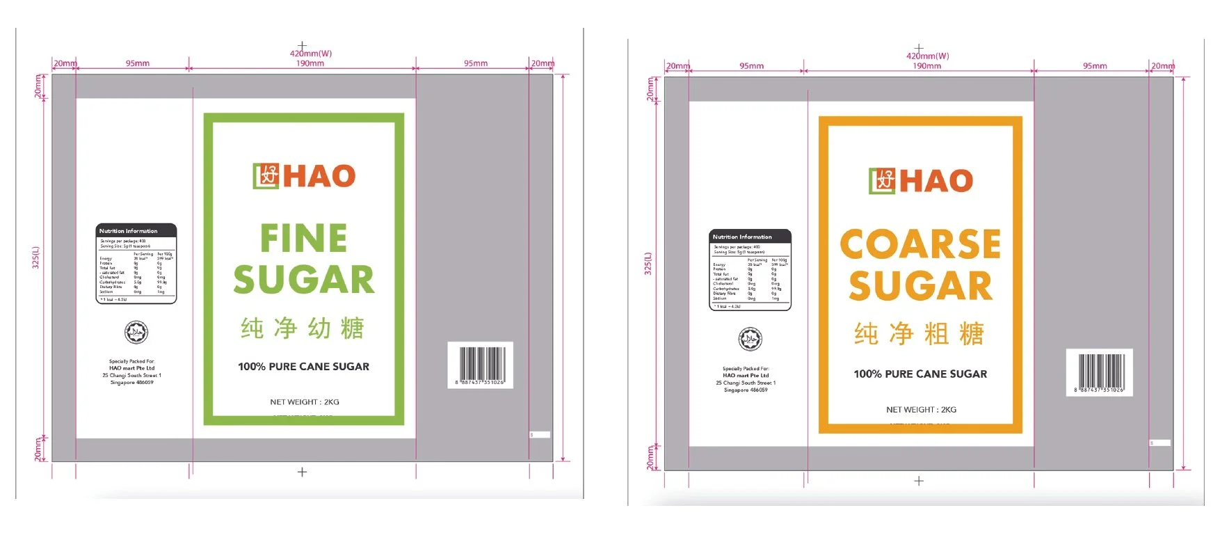 Image 6 of 10
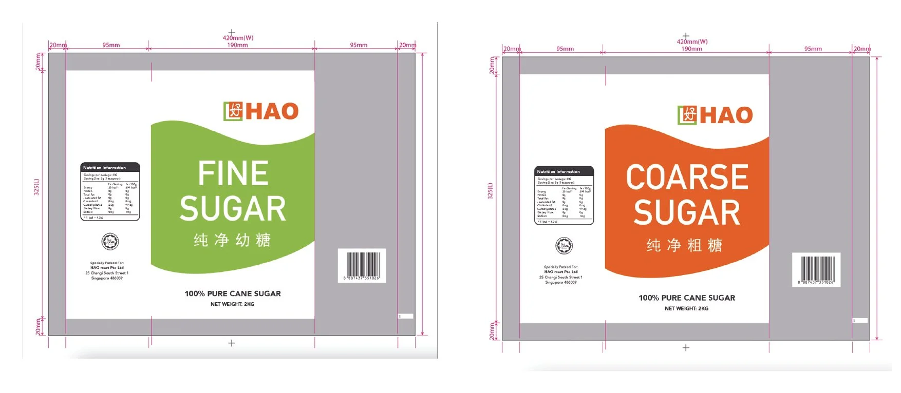 Image 7 of 10
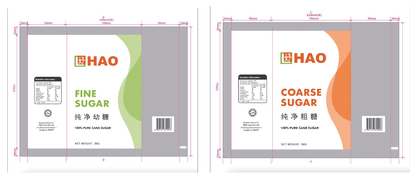 Image 8 of 10
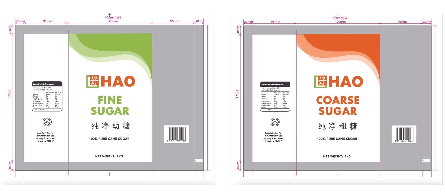 Image 9 of 10
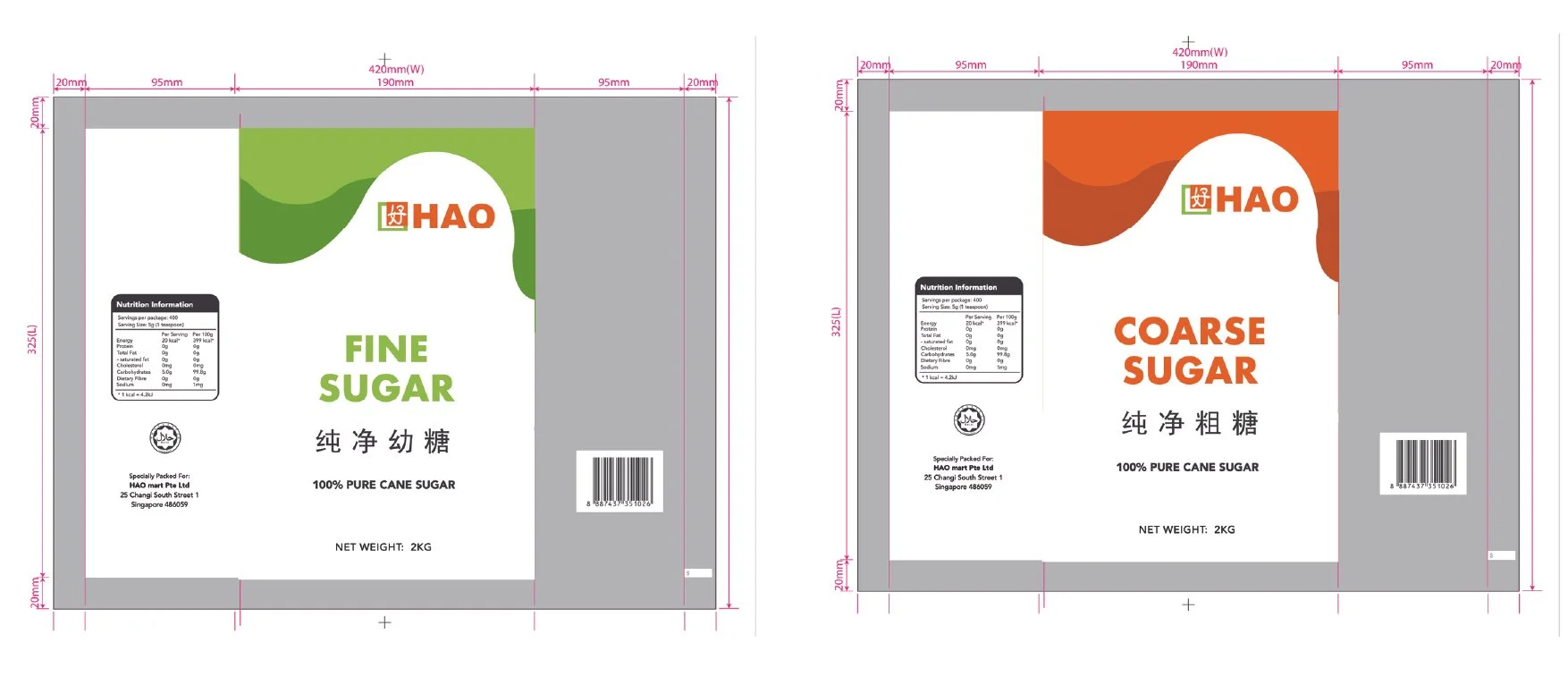 Image 10 of 10