 Image 1 of 2
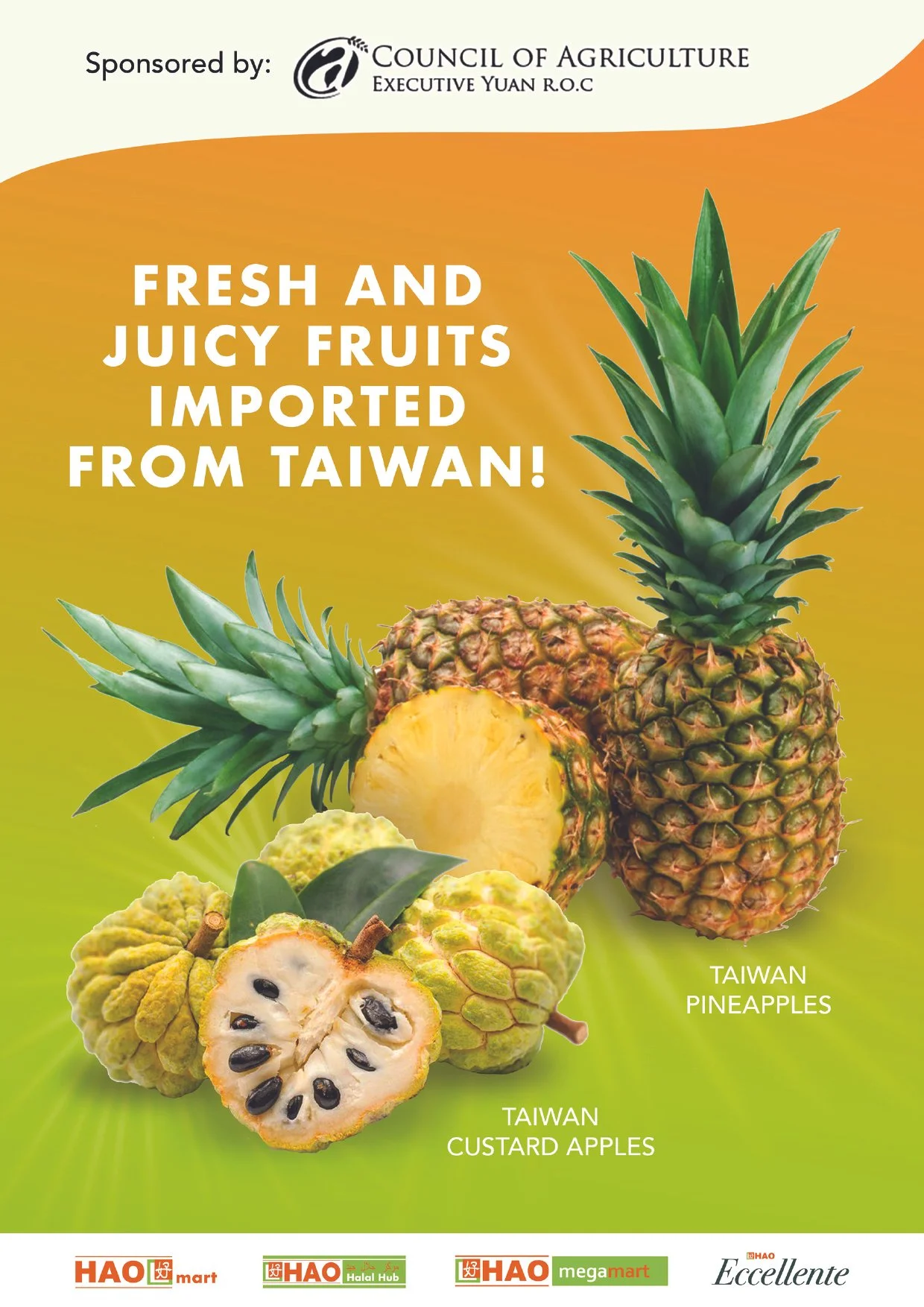 Image 2 of 2
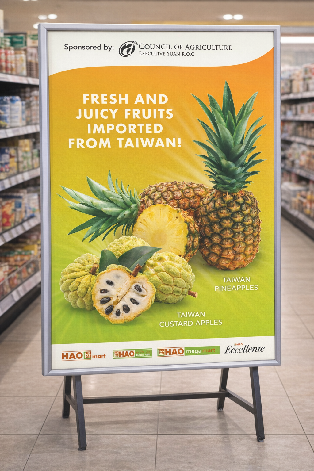
The Taiwan Fruits campaign for HAO is designed to highlight the freshness, quality, and vibrant appeal of imported produce through a bold and visually engaging key visual. A warm gradient background transitions from orange to green, symbolising ripeness and natural freshness while drawing immediate attention in-store. The composition places the fruits at the centre, using scale and sharp imagery to emphasise texture and juiciness, making the products instantly appetising. Clean, bold typography ensures the message is clear and impactful from a distance, while supporting information is kept minimal to maintain focus on the hero visuals. When translated into a physical poster format, the design achieves strong visibility within the retail environment—standing out against busy surroundings while reinforcing HAO’s positioning as a trusted source for high-quality imported produce.
The Taiwan Fruits campaign for HAO is designed to highlight the freshness, quality, and vibrant appeal of imported produce through a bold and visually engaging key visual. A warm gradient background transitions from orange to green, symbolising ripeness and natural freshness while drawing immediate attention in-store. The composition places the fruits at the centre, using scale and sharp imagery to emphasise texture and juiciness, making the products instantly appetising. Clean, bold typography ensures the message is clear and impactful from a distance, while supporting information is kept minimal to maintain focus on the hero visuals. When translated into a physical poster format, the design achieves strong visibility within the retail environment—standing out against busy surroundings while reinforcing HAO’s positioning as a trusted source for high-quality imported produce.