 Image 1 of 4
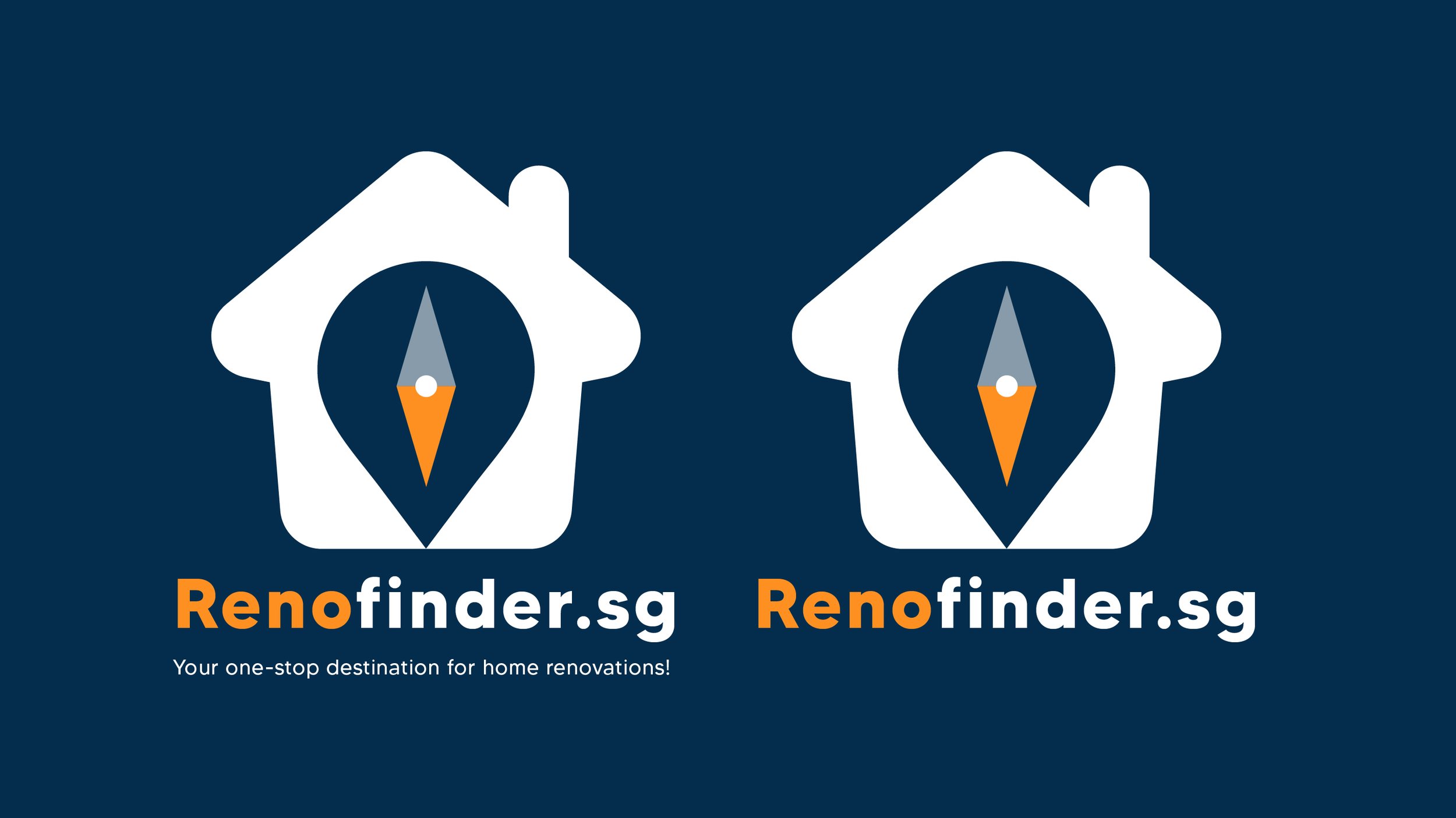 Image 2 of 4
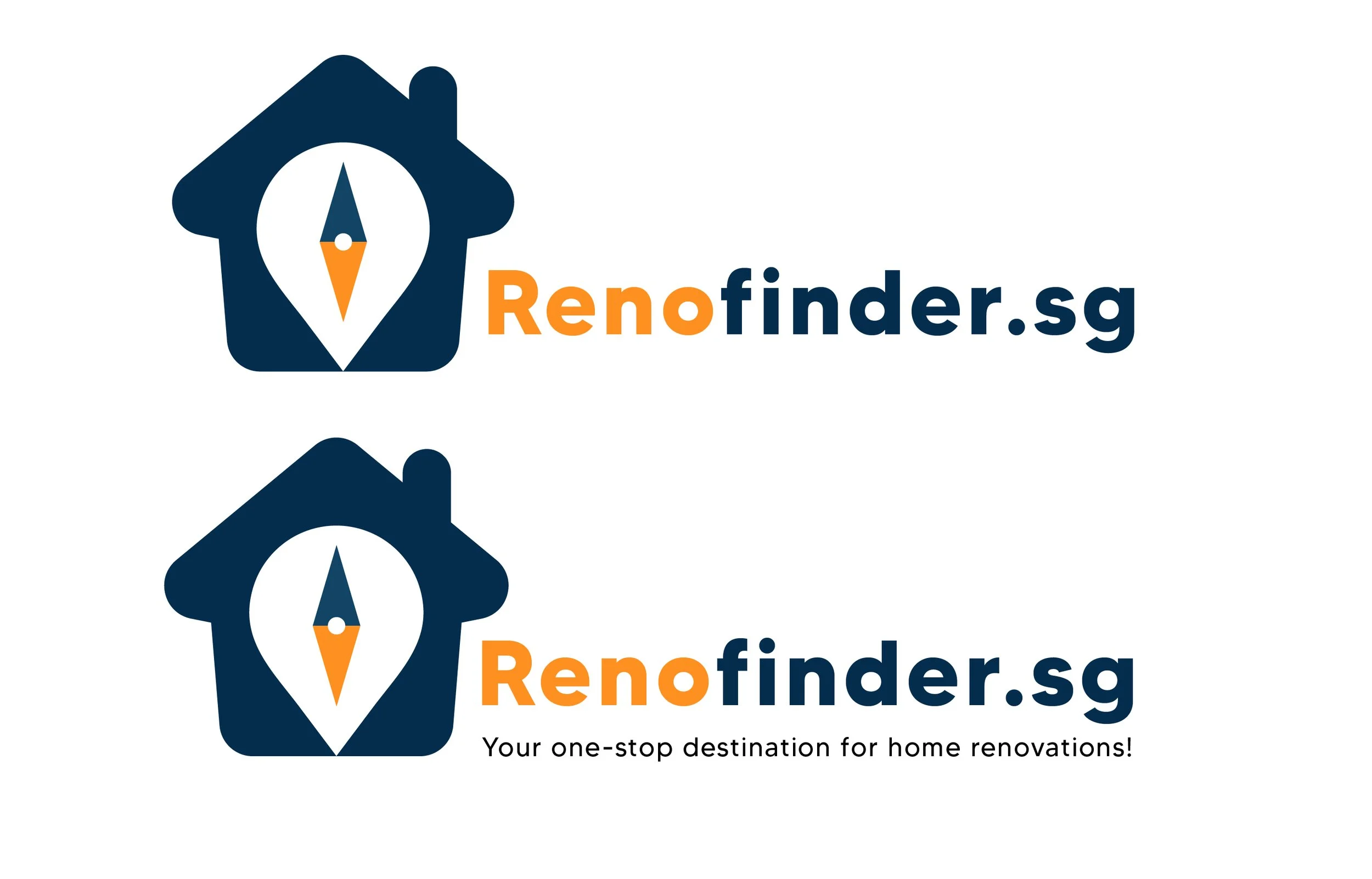 Image 3 of 4
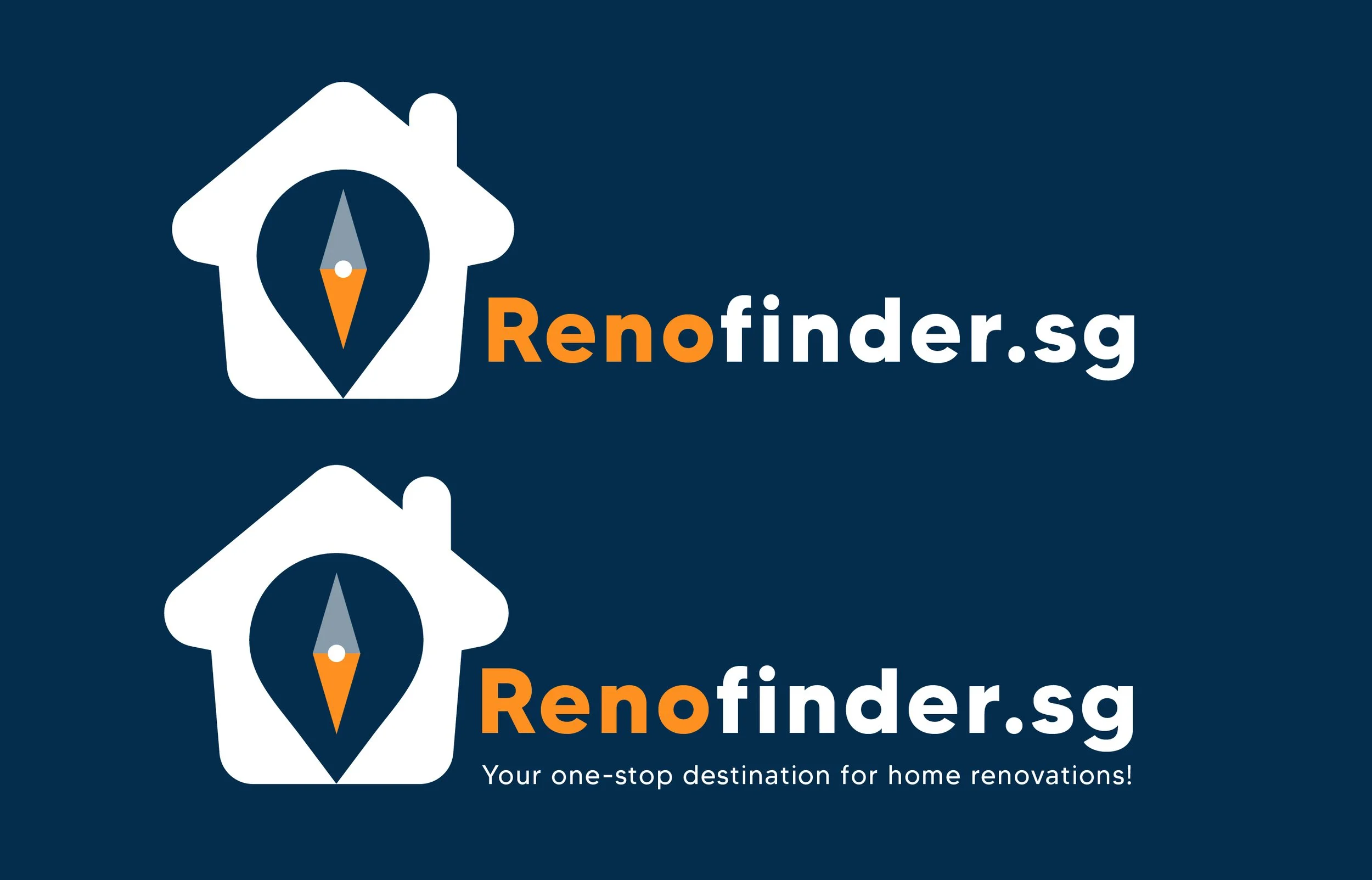 Image 4 of 4
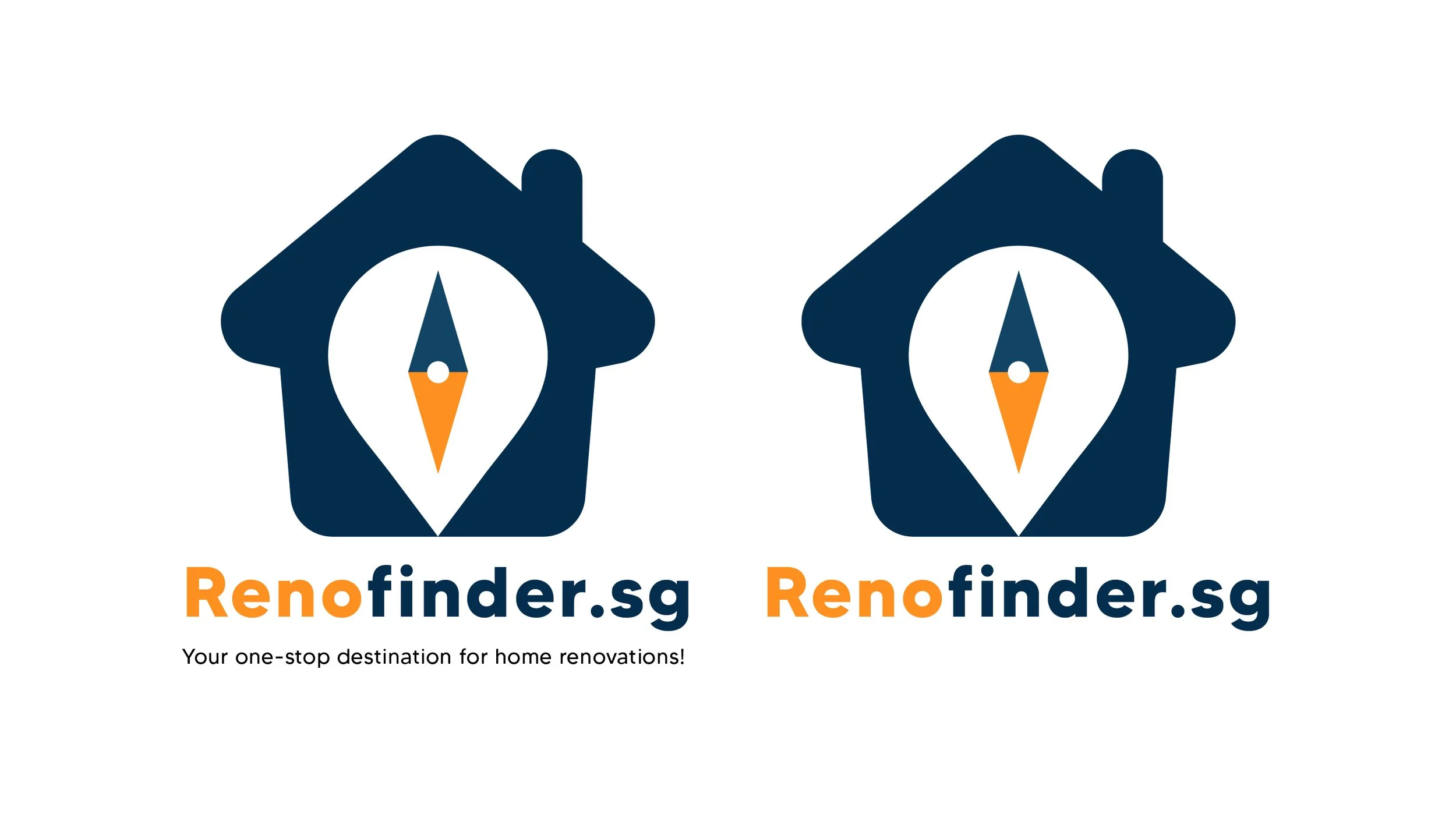
This project involved designing a clean and modern logo for Renofinder.sg, a platform focused on helping users navigate renovation and property-related services.
The concept combines two core visual elements: a house silhouette and a location pin. The house represents home and renovation, while the pin symbolizes discovery, guidance, and connection—key aspects of the platform’s purpose. At the center of the pin, a subtle directional marker was incorporated to reinforce the idea of precision and helping users find the right solutions.
The color palette was intentionally kept minimal yet impactful. A deep navy blue conveys trust, professionalism, and reliability, while the contrasting orange adds warmth and energy, drawing attention to the brand name and key visual element.
The overall design approach prioritizes clarity, scalability, and recognizability. The logo is versatile across digital and print applications, maintaining its integrity even at smaller sizes, as demonstrated by the icon variation.
This project highlights my ability to translate brand identity into a simple yet meaningful visual system, combining symbolism and functionality to create a distinctive and purposeful design.