The UI for muvee 360 Video Stitcher’s trial and payment flow is designed to be clear, unobtrusive, and conversion-focused—guiding users from exploration to purchase without disrupting their creative workflow. Rather than overwhelming users with prompts, the experience introduces upgrade cues at natural touchpoints, such as export actions or feature limitations, ensuring the messaging feels timely and relevant.
The trial interface communicates value upfront, clearly outlining what users can access and what is unlocked upon upgrading. Visual hierarchy plays a key role here—important details like trial duration, remaining days, and feature restrictions are presented in a clean, digestible layout. Subtle highlights and call-to-action buttons draw attention to upgrade options without feeling aggressive, maintaining a balanced user experience.
In the payment flow, simplicity and trust are prioritised. The UI uses straightforward language, minimal steps, and a structured layout to reduce friction during checkout. Pricing tiers, if applicable, are presented in an easy-to-compare format, allowing users to quickly understand their options. Consistent branding and clean design elements help reinforce credibility, while clear confirmation states ensure users feel confident throughout the transaction.
Overall, the trial and payment UX is designed to support decision-making rather than pressure it—creating a smooth transition from free exploration to paid usage, while maintaining the product’s overall sense of clarity and ease.
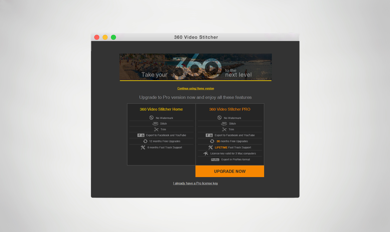 Image 1 of 8
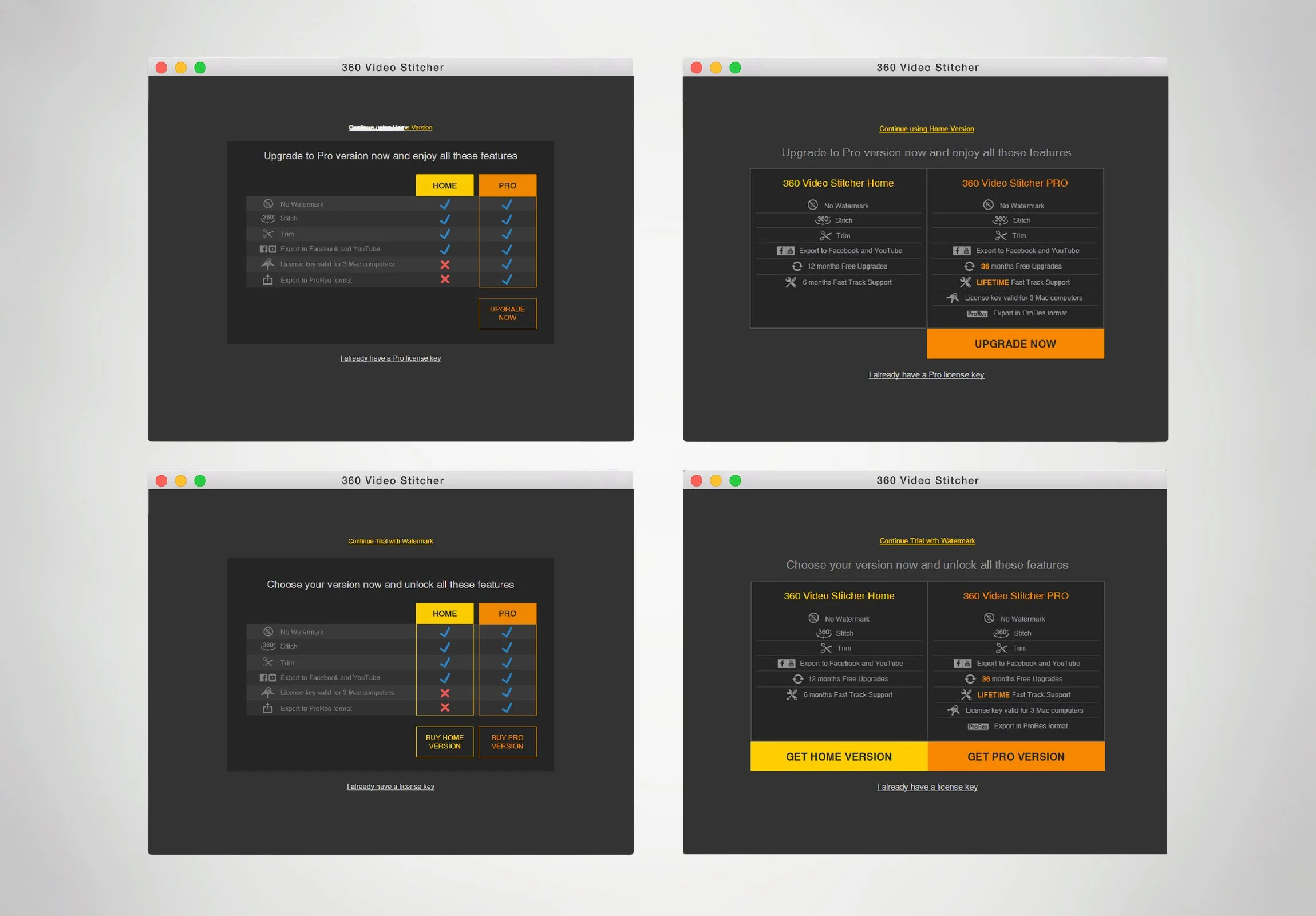 Image 2 of 8
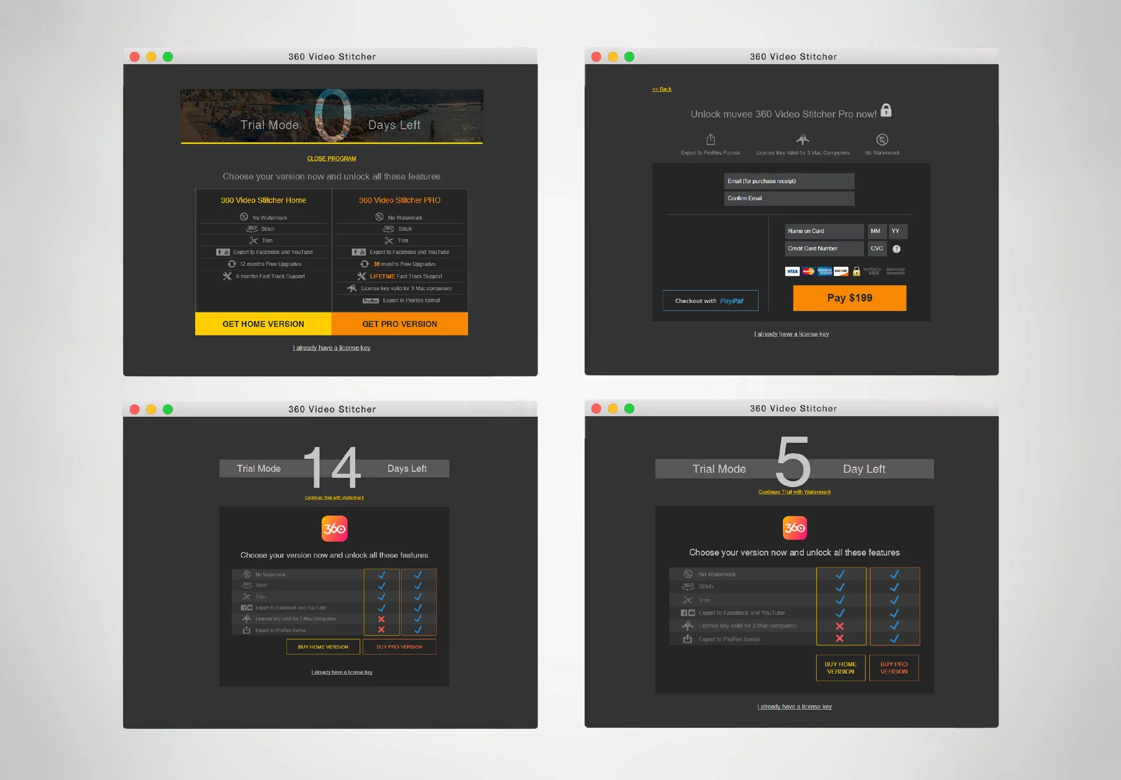 Image 3 of 8
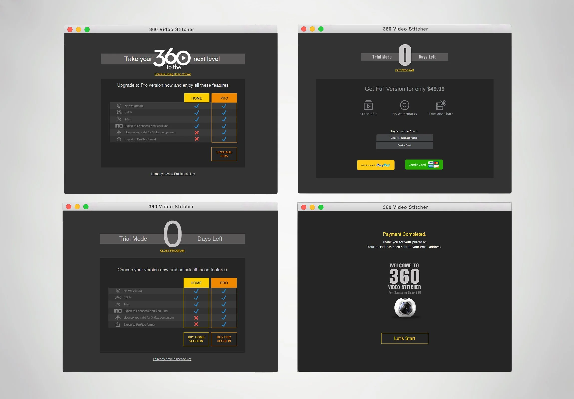 Image 4 of 8
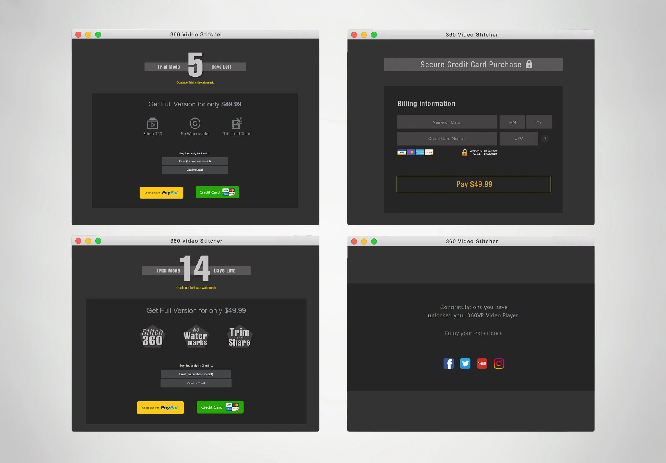 Image 5 of 8
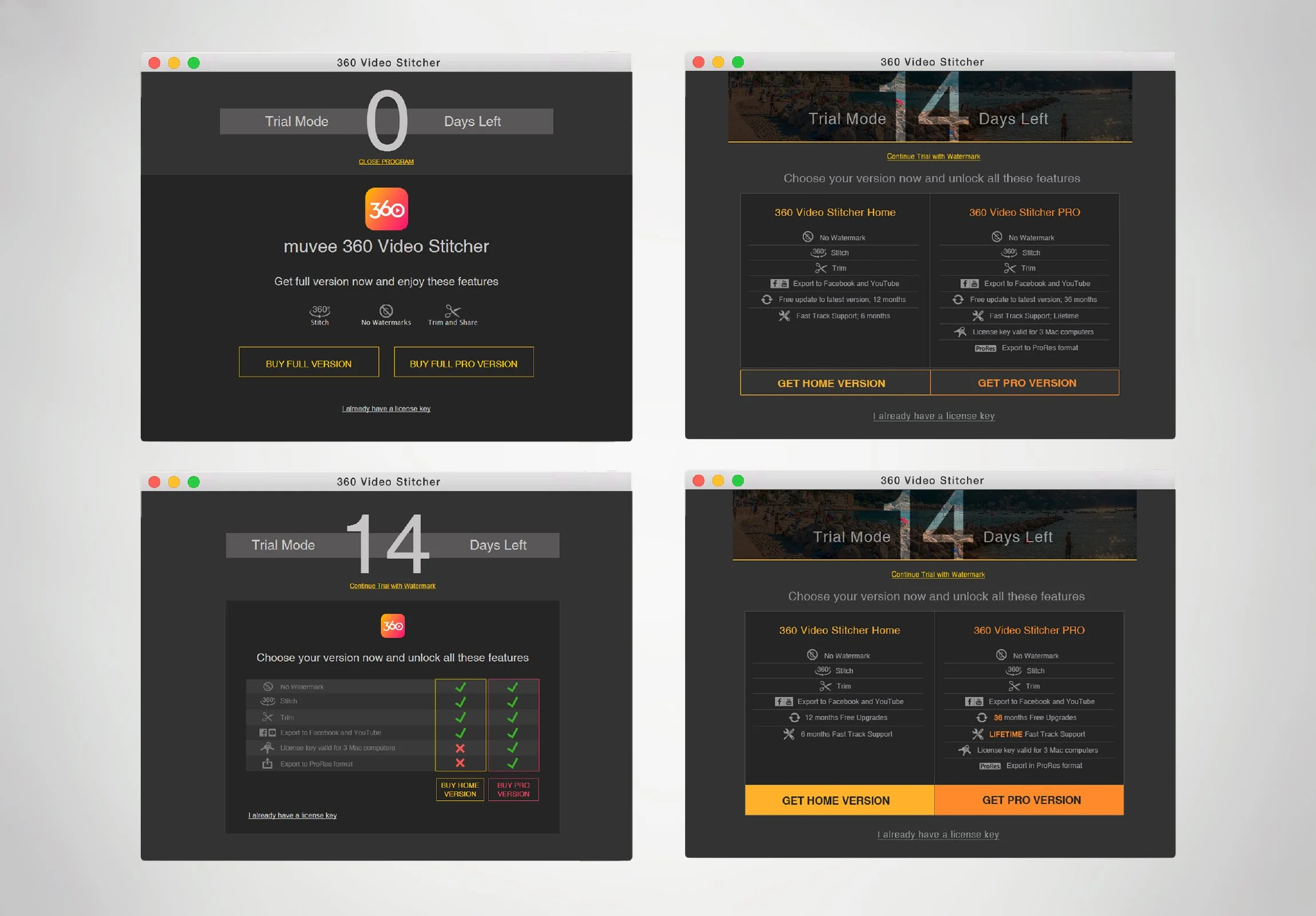 Image 6 of 8
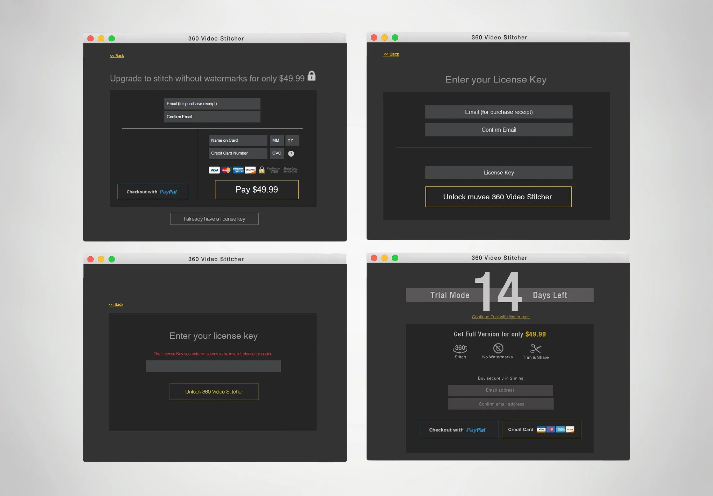 Image 7 of 8
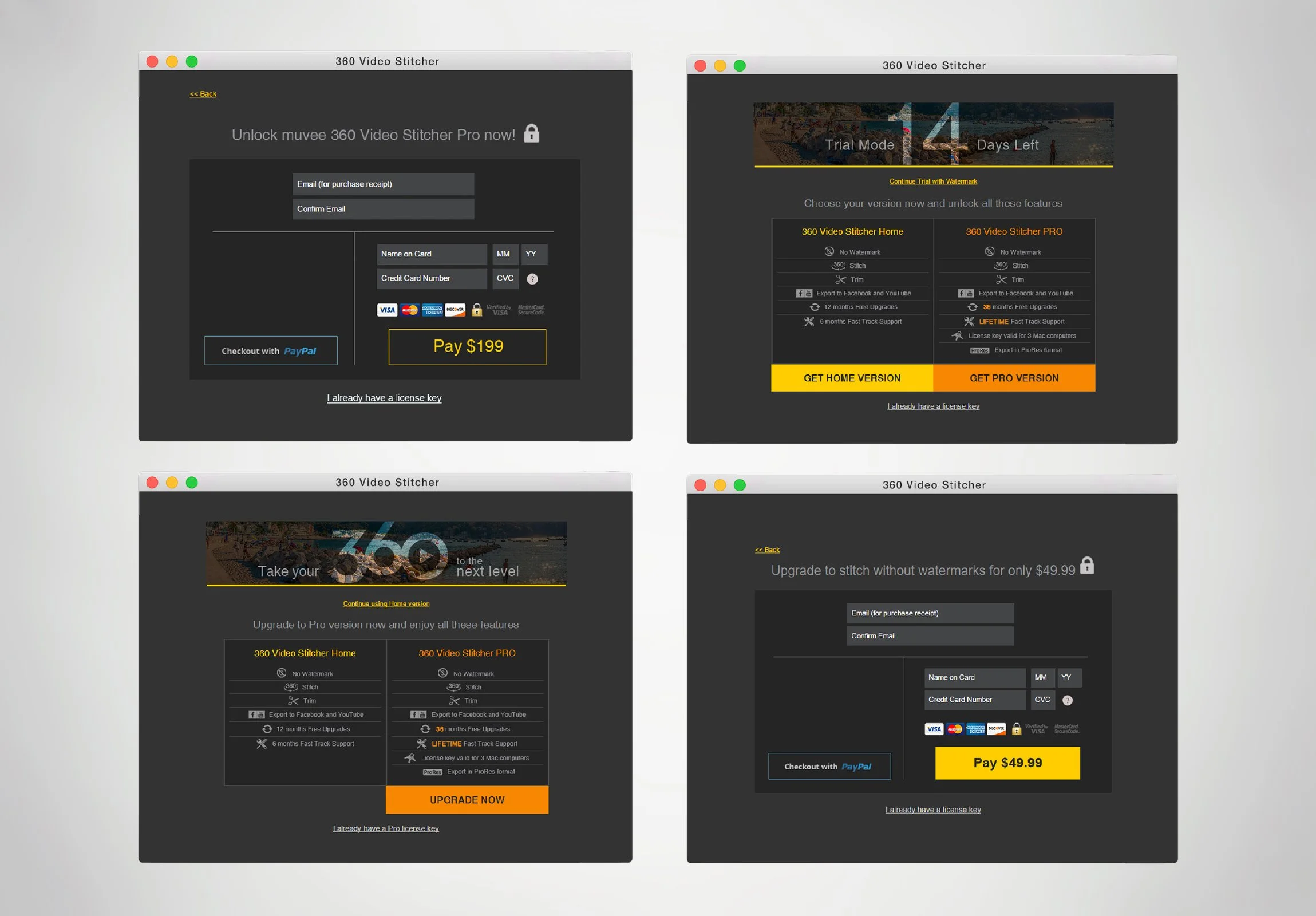 Image 8 of 8