 Image 1 of 1
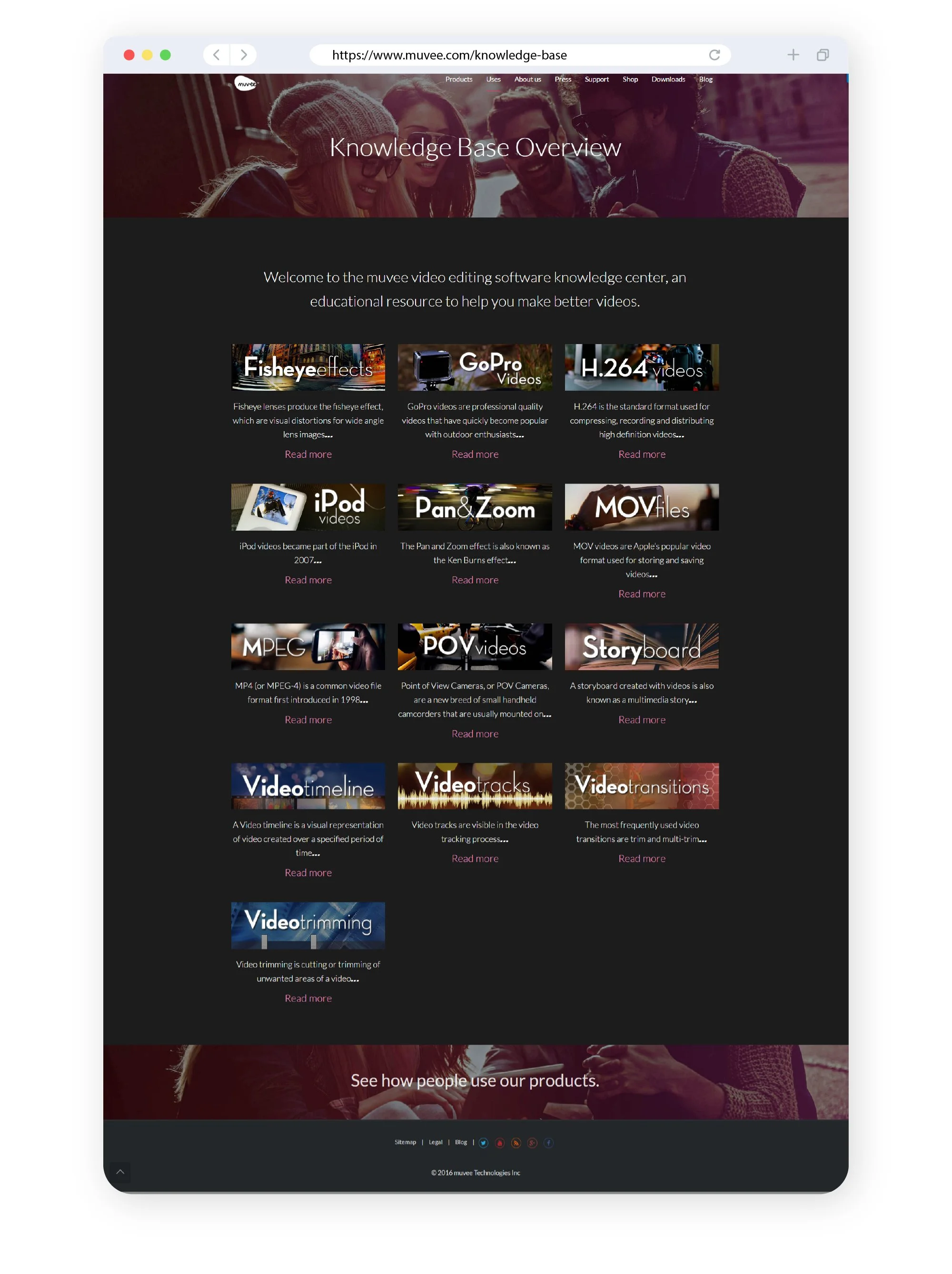
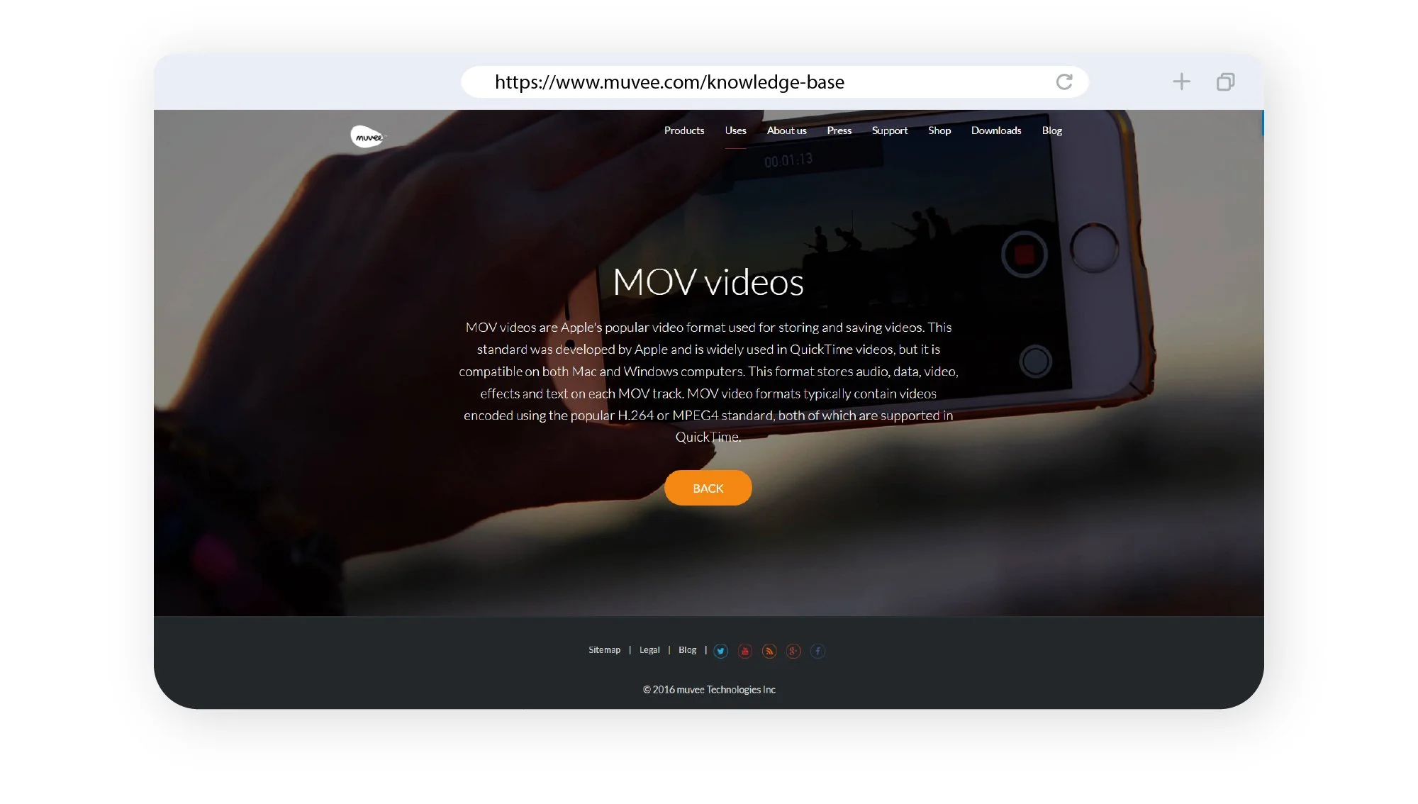
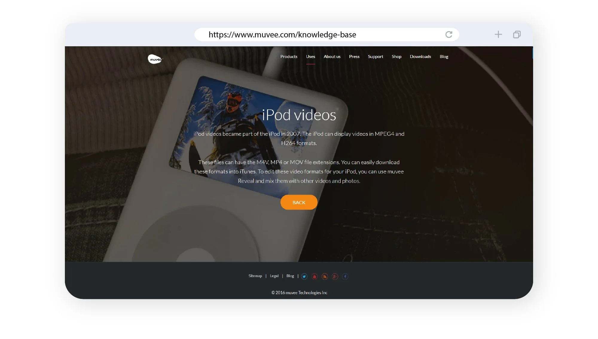
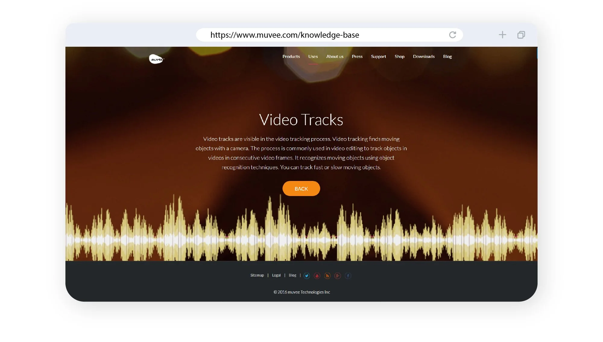
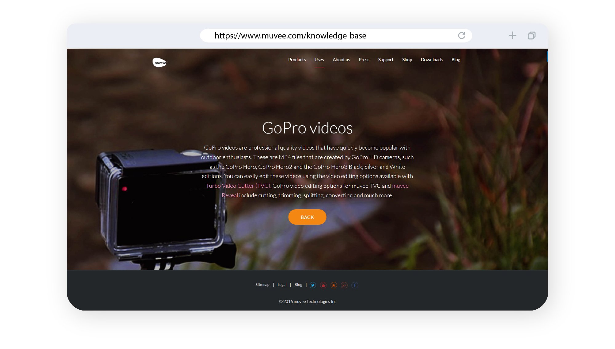
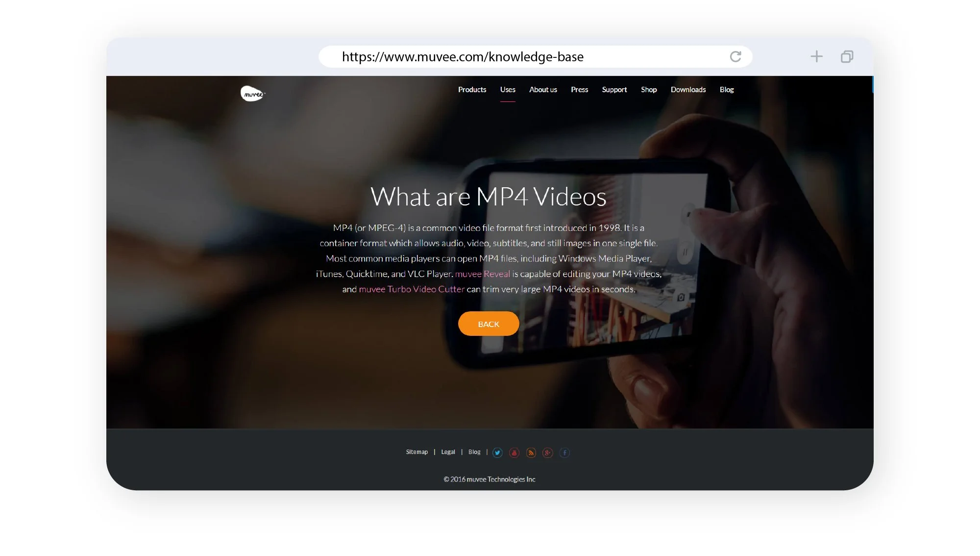
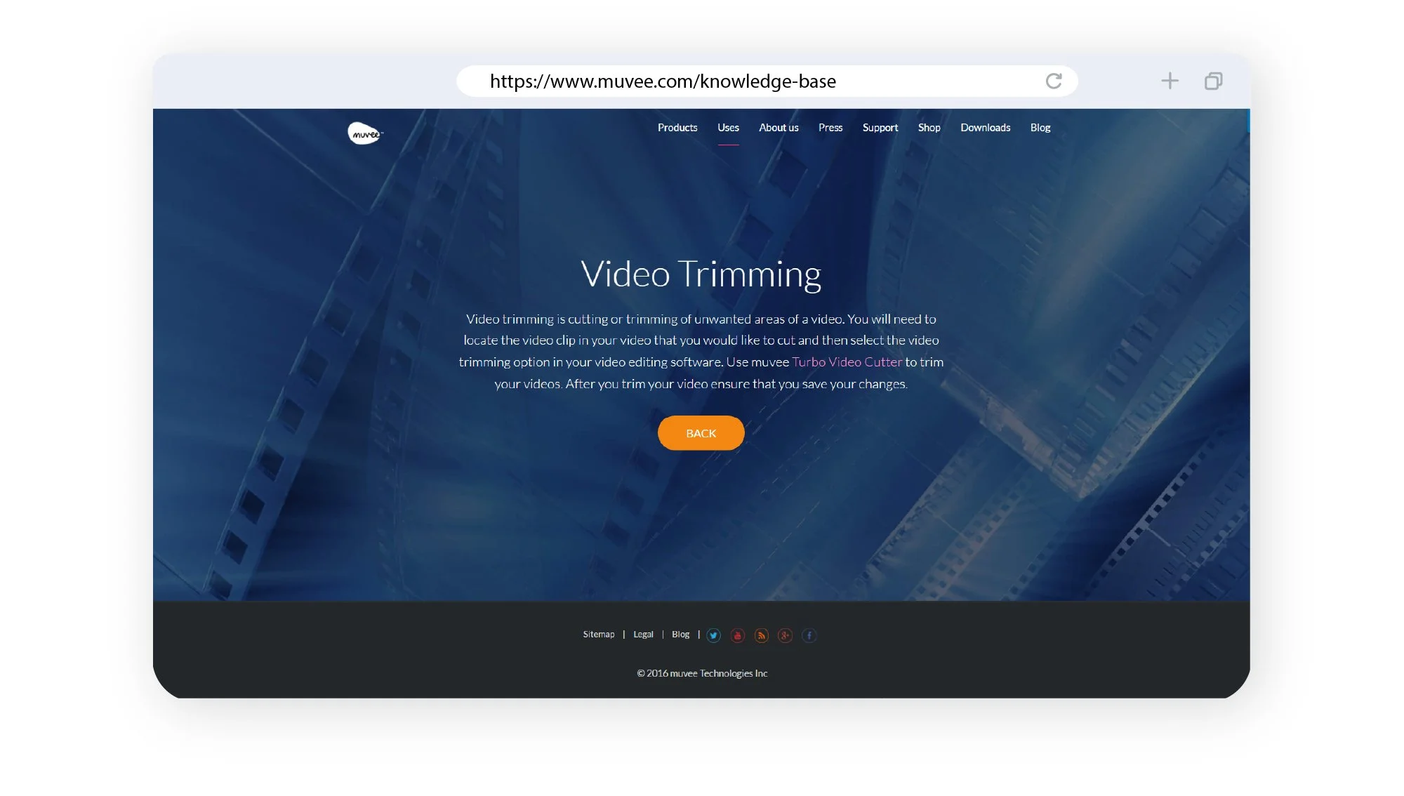
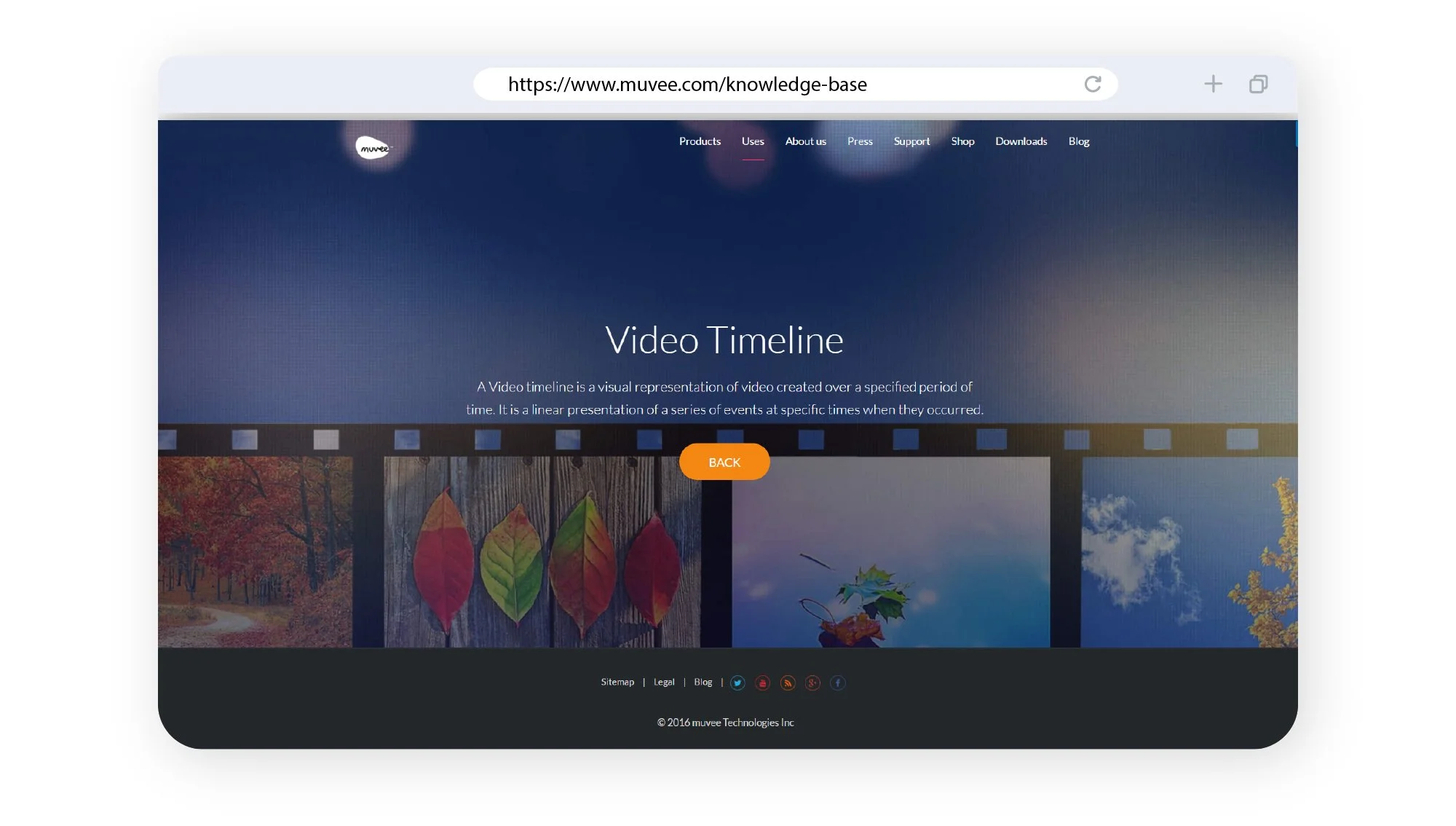
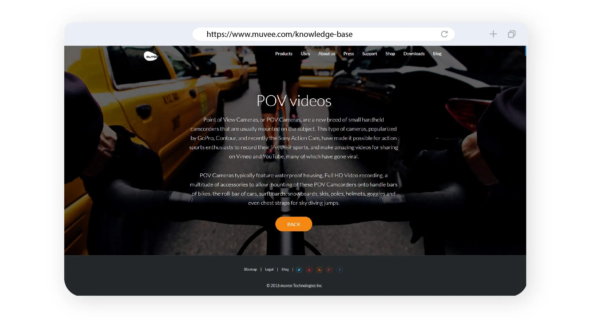
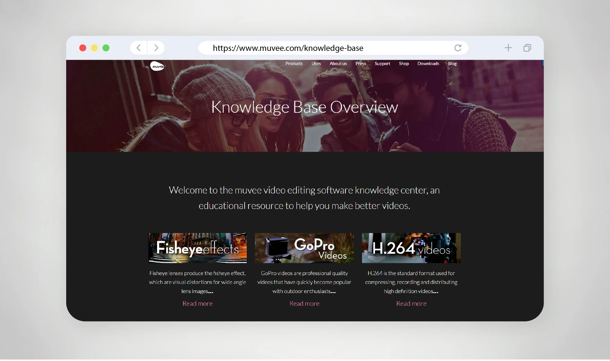
The knowledge base website pages for muvee are designed to support users with clear, structured, and easily accessible information—extending the product experience beyond the software itself. Built as a self-service support hub, the design focuses on helping users quickly find answers, learn features, and troubleshoot issues without friction.
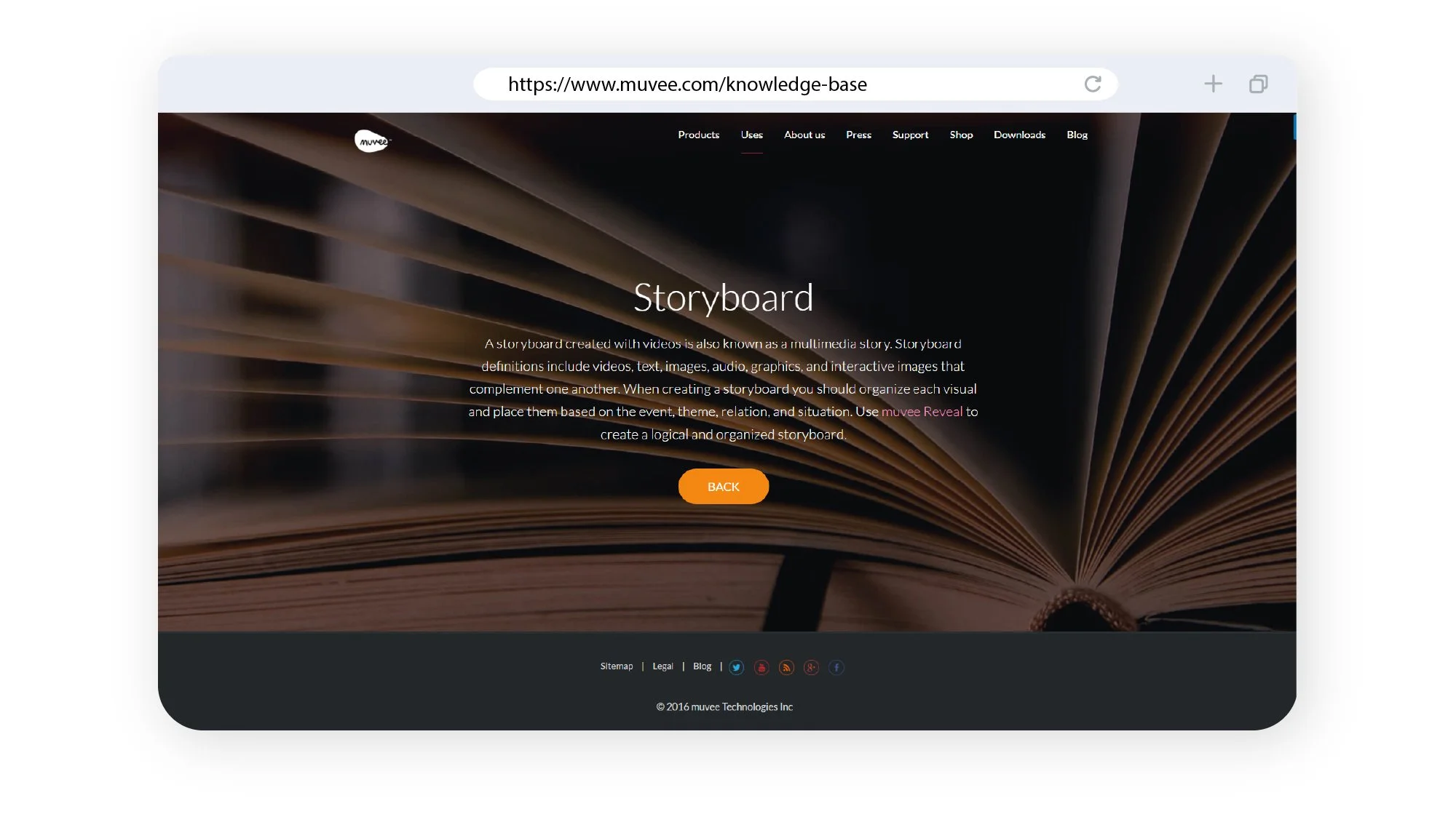
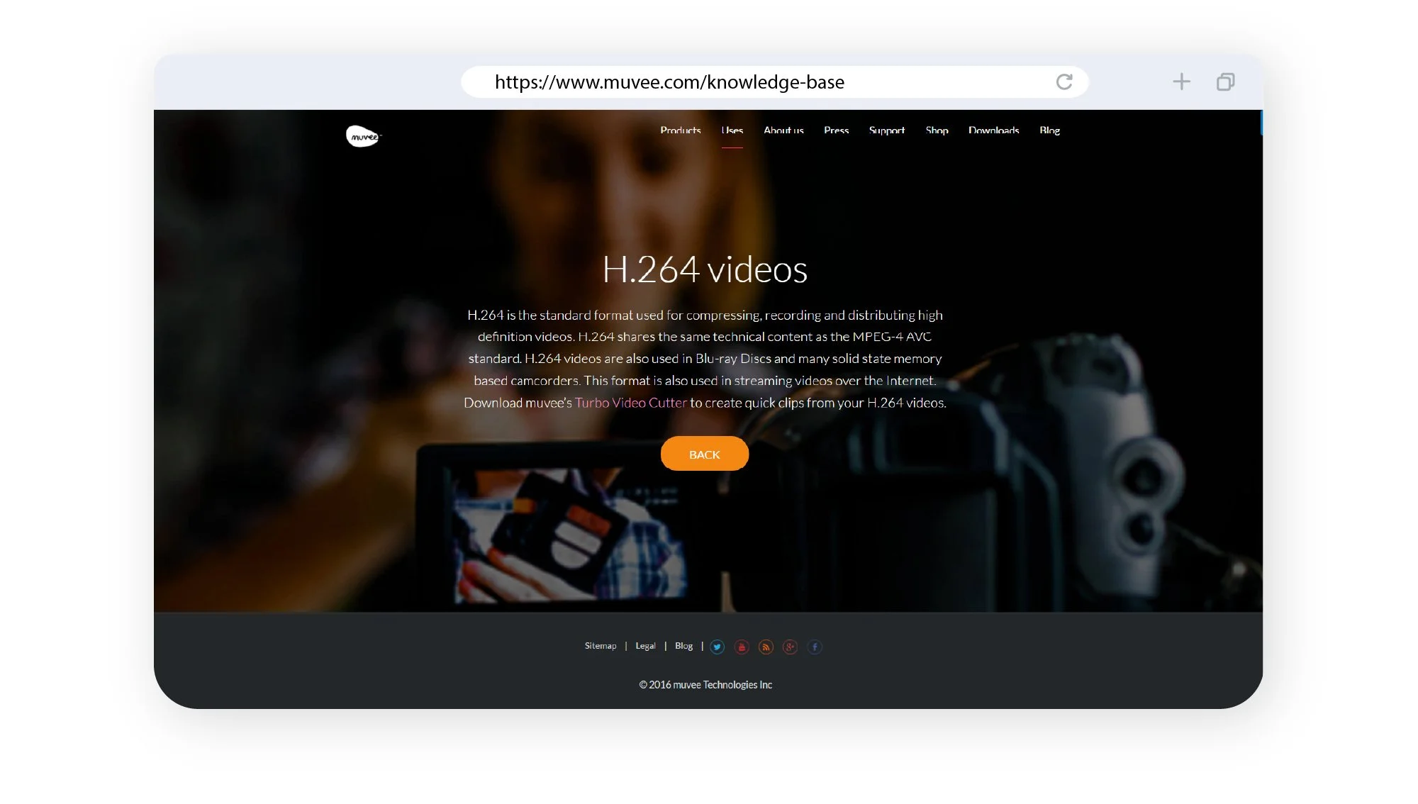
From a UX perspective, the layout is highly structured, typically organised into categories, sections, and individual articles. This hierarchy allows users to navigate content intuitively—whether they are browsing broadly or searching for specific topics. Elements such as search bars, category groupings, and quick links are prioritised to reduce time-to-answer and improve usability. Knowledge base platforms often centre the homepage around discoverability, with navigation, categories, and featured content guiding users efficiently .
The visual design leans towards clarity and readability. Clean typography, ample spacing, and minimal distractions ensure that content remains the primary focus. Consistent formatting across articles—such as headings, step-by-step instructions, and highlighted notes—helps users scan and absorb information quickly, especially when troubleshooting or learning new features.
Additionally, the design considers scalability and maintenance. Pages are modular and easy to update, allowing new content, features, or product updates to be added seamlessly. This ensures the knowledge base evolves alongside muvee’s software ecosystem while maintaining a consistent user experience.
Overall, the knowledge base pages are designed to be functional, intuitive, and user-centric—providing a reliable support system that enhances usability, reduces dependency on direct support, and empowers users to make the most of muvee’s tools.
The knowledge base website pages for muvee are designed to support users with clear, structured, and easily accessible information—extending the product experience beyond the software itself. Built as a self-service support hub, the design focuses on helping users quickly find answers, learn features, and troubleshoot issues without friction.
From a UX perspective, the layout is highly structured, typically organised into categories, sections, and individual articles. This hierarchy allows users to navigate content intuitively—whether they are browsing broadly or searching for specific topics. Elements such as search bars, category groupings, and quick links are prioritised to reduce time-to-answer and improve usability. Knowledge base platforms often centre the homepage around discoverability, with navigation, categories, and featured content guiding users efficiently .
The visual design leans towards clarity and readability. Clean typography, ample spacing, and minimal distractions ensure that content remains the primary focus. Consistent formatting across articles—such as headings, step-by-step instructions, and highlighted notes—helps users scan and absorb information quickly, especially when troubleshooting or learning new features.
Additionally, the design considers scalability and maintenance. Pages are modular and easy to update, allowing new content, features, or product updates to be added seamlessly. This ensures the knowledge base evolves alongside muvee’s software ecosystem while maintaining a consistent user experience.
Overall, the knowledge base pages are designed to be functional, intuitive, and user-centric—providing a reliable support system that enhances usability, reduces dependency on direct support, and empowers users to make the most of muvee’s tools.