 Image 1 of 3
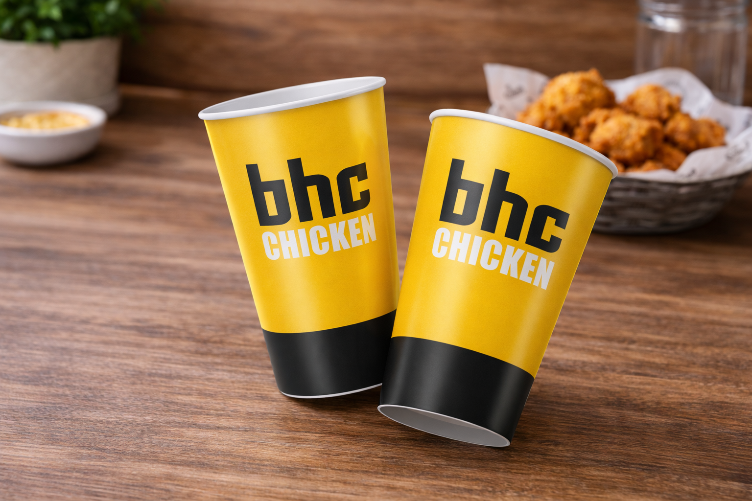 Image 2 of 3
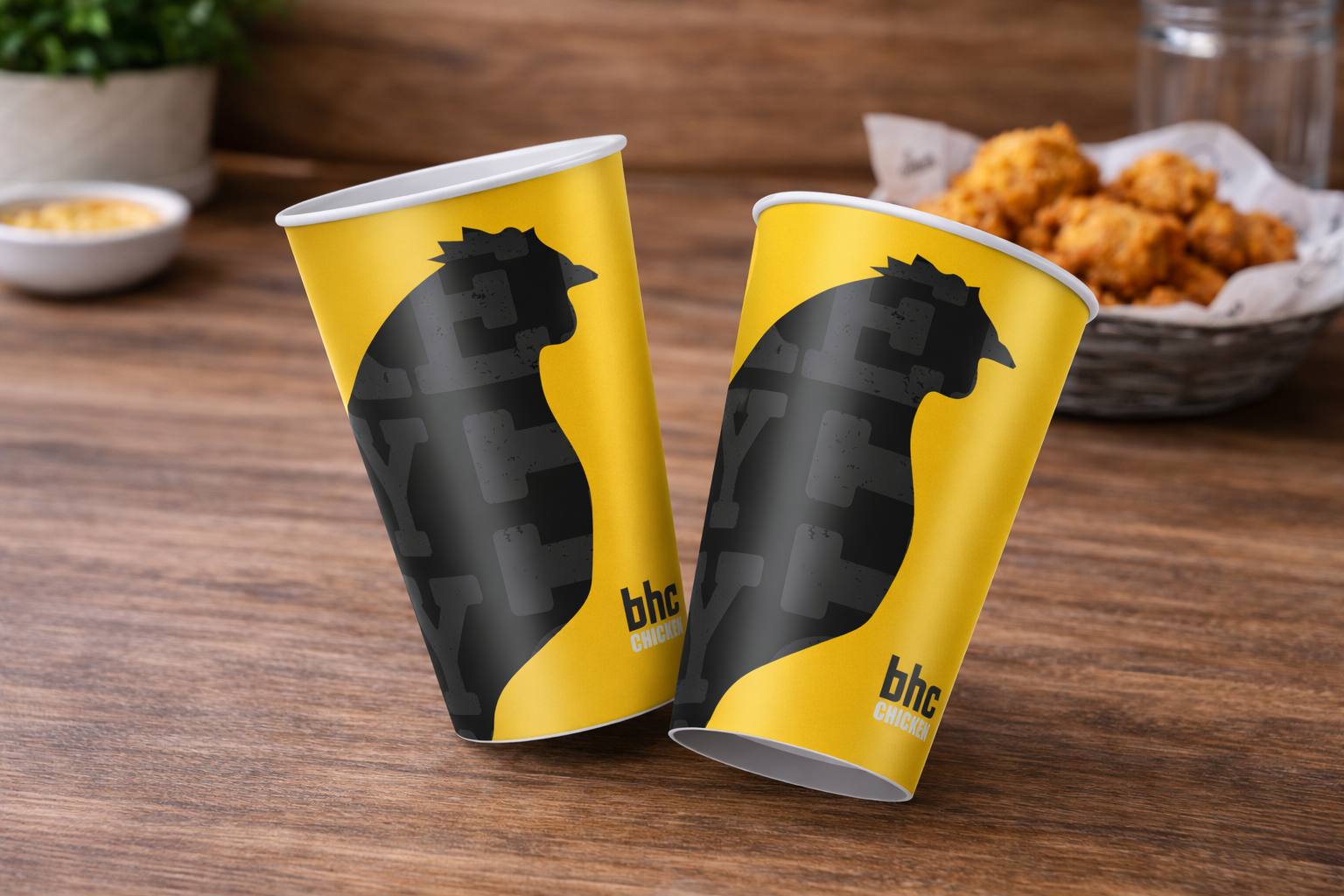 Image 3 of 3
The selected paper cup design focuses on strong brand visibility and everyday usability. A bold yellow base was used to reinforce brand recognition, while the clean placement of the bhc chicken logotype ensures immediate legibility from multiple angles. The minimal colour palette and straightforward layout were intentionally kept simple to suit high-volume production and fast-paced food service environments, resulting in a practical yet distinctive packaging solution that aligned well with the brand’s identity and operational needs.
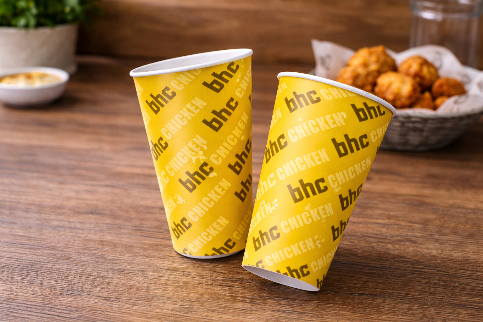
Two additional concepts were explored to push the brand expression further. One direction featured an all-over typographic pattern to create a more energetic and dynamic look, emphasising repetition and movement across the cup surface. Another concept introduced a bold graphic silhouette to build a stronger visual narrative and a more premium, statement-driven aesthetic.
While these designs were not selected due to considerations around clarity, scalability, and production practicality, they demonstrate exploratory thinking in applying brand elements across packaging formats and reflect different creative approaches considered during the design process.
The selected paper cup design focuses on strong brand visibility and everyday usability. A bold yellow base was used to reinforce brand recognition, while the clean placement of the bhc chicken logotype ensures immediate legibility from multiple angles. The minimal colour palette and straightforward layout were intentionally kept simple to suit high-volume production and fast-paced food service environments, resulting in a practical yet distinctive packaging solution that aligned well with the brand’s identity and operational needs.
Two additional concepts were explored to push the brand expression further. One direction featured an all-over typographic pattern to create a more energetic and dynamic look, emphasising repetition and movement across the cup surface. Another concept introduced a bold graphic silhouette to build a stronger visual narrative and a more premium, statement-driven aesthetic.
While these designs were not selected due to considerations around clarity, scalability, and production practicality, they demonstrate exploratory thinking in applying brand elements across packaging formats and reflect different creative approaches considered during the design process.