 Image 1 of 1
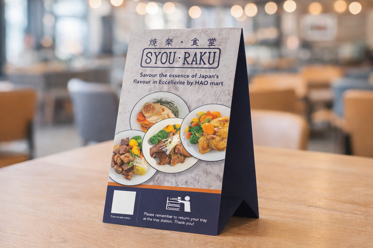
This tent card was designed for Syou Raku as part of the in-store POS experience, serving as both a visual highlight and a functional touchpoint at the dining table. The objective was to present key information clearly while reinforcing the brand’s identity in a compact format.
The layout emphasises appetising food imagery, drawing immediate attention and enhancing the dining appeal. Clean typography and structured spacing ensure readability, while subtle Japanese-inspired elements maintain a cohesive brand aesthetic across all touchpoints.
A QR code is integrated to encourage seamless interaction, allowing customers to access the menu quickly, while supporting messaging guides user behaviour within the space. Overall, the design balances clarity, usability, and visual appeal, contributing to a more engaging and intuitive dining experience.