 Image 1 of 1
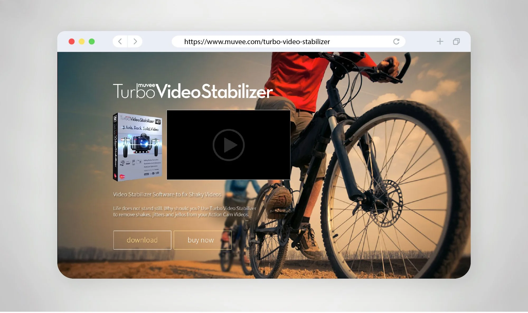
The revamped website for Turbo Video Stabilizer is designed to elevate both visual impact and user clarity—transforming a feature-heavy product into a more engaging and structured digital experience. The design adopts a cinematic, high-energy approach, using action-driven imagery in the hero section to immediately communicate the product’s core benefit: stabilising motion-heavy footage.
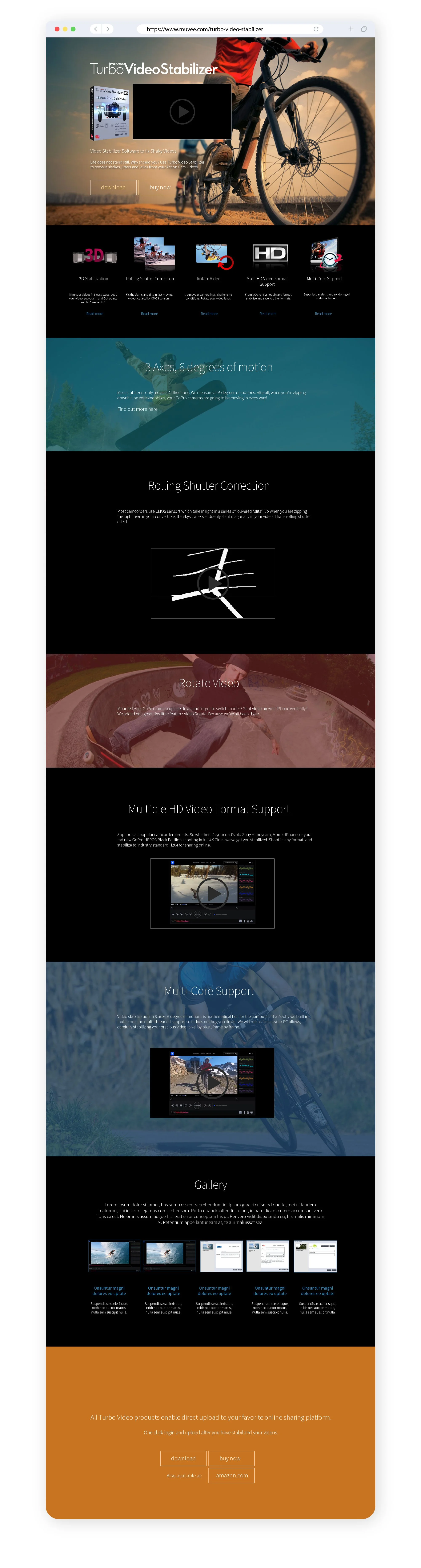
A strong dark-themed interface anchors the overall design, allowing key visuals, icons, and content blocks to stand out with greater contrast. Feature sections are broken down into clear, digestible modules—each paired with simple iconography and short descriptions to help users quickly հասկstand capabilities such as rolling shutter correction, HD format support, and multi-core processing.
The layout follows a smooth vertical storytelling flow, guiding users from introduction to deeper feature exploration, supported by video previews and visual demonstrations. Subtle transitions between sections, including colour shifts and full-width imagery, help maintain engagement while preventing visual fatigue.
Call-to-action elements like “Download” and “Buy Now” are strategically placed throughout the page, ensuring accessibility without disrupting the browsing experience. The inclusion of a gallery and supporting visuals further reinforces credibility by showcasing real outputs and use cases.
Overall, the revamp focuses on clarity, hierarchy, and visual storytelling—presenting a technical product in a way that feels accessible, modern, and conversion-driven.
The revamped website for Turbo Video Stabilizer is designed to elevate both visual impact and user clarity—transforming a feature-heavy product into a more engaging and structured digital experience. The design adopts a cinematic, high-energy approach, using action-driven imagery in the hero section to immediately communicate the product’s core benefit: stabilising motion-heavy footage.
A strong dark-themed interface anchors the overall design, allowing key visuals, icons, and content blocks to stand out with greater contrast. Feature sections are broken down into clear, digestible modules—each paired with simple iconography and short descriptions to help users quickly հասկstand capabilities such as rolling shutter correction, HD format support, and multi-core processing.
The layout follows a smooth vertical storytelling flow, guiding users from introduction to deeper feature exploration, supported by video previews and visual demonstrations. Subtle transitions between sections, including colour shifts and full-width imagery, help maintain engagement while preventing visual fatigue.
Call-to-action elements like “Download” and “Buy Now” are strategically placed throughout the page, ensuring accessibility without disrupting the browsing experience. The inclusion of a gallery and supporting visuals further reinforces credibility by showcasing real outputs and use cases.
Overall, the revamp focuses on clarity, hierarchy, and visual storytelling—presenting a technical product in a way that feels accessible, modern, and conversion-driven.